Blog

  • Sigma vs. Nerd (Part 1: Sensor School)

    Sigma vs. Nerd (Part 1: Sensor School)

    Anyone who has followed the ULTRAsomething journey for the past several years knows how passionately I’ve lusted for a monochromatic digital camera. A simple perusal of this site should effectively confirm just how little use I have for the color features inherent in modern cameras. Were you to gain access to my private stock of color photos, you’d also see how little talent I have for shooting color. I am a black & white photographer — through and through.

    Since the dawn of digital, I’ve known enough about the technology’s inner workings to know that removing a camera’s color capabilities would have significant advantages for BW imaging.  Naturally, I assumed that manufacturers would hear a deafening din of demand from other, similarly-minded BW photographers, and that such a camera would soon arrive on the market. But it never did. Even more surprising was my realization that my BW brethren seemed to have no interest in the idea of a BW digital camera and, worse, some of them even mocked those of us who held fast to such crazy desires. Undaunted, and determined to do something about it, I decided it was time to start lobbying for the camera of my dreams. Since the bulk of my photographic activites demand that I use old-school rangefinder cameras, I started actively pestering Leica to release a BW camera. This time, I apparently wasn’t alone. Because much to my (and everyone else’s) surprise, Leica did exactly that in 2012. That camera — the Leica M Monochrom — is, without a doubt, the most perfect camera ever created for my particular needs and proclivities, with just one single exception: its price.

    When Leica first released the Monochrom, they graciously allowed me to borrow one for a couple of months. This experience lead to my three part “Fetishist’s Guide to the Monochrom” review. Sadly, it also increased my already pathological desire to one day own a monochromatic camera, which caused me some serious postpartum depression once I shipped it back to Germany.

    After my Monochrom experiences, I had little interest in returning to the quaint and ridiculous process of converting compromised color images into BW. Because of this, I spent the past two years shooting mostly BW film, while waiting patiently either to win the lottery, or for some company to follow Leica’s example and release a monochromatic camera — one that I could actually afford.

    So when Sigma announced their new Quattro series cameras a couple months ago, I was intrigued. Sigma uses a unique type of sensor in its cameras — a Foveon sensor. Even though Foveons are designed for color photography (and produce some of the most beautiful color images I’ve yet seen emerge from a digital camera), it’s their untapped potential as monochromatic cameras that interests me.

    The more I thought about the redesigned sensor in these new Quattro cameras, the more convinced I became that Sigma was just a couple of marketing decisions away from engineering a monochromatic RAW file format — thus creating a camera with many of the same imaging advantages currently enjoyed by the Leica M Monochrom.

    I contacted Sigma and expressed my wishes that the upcoming Quattro camera support a second, user-selectable RAW format — one that basically used only the data collected by the camera’s top sensor layer. Unlike Leica (who had to design a special sensor to remove the ubiquitous Bayer filter), Sigma is already manufacturing cameras with Bayer-less sensors — actually they’re manufacturing cameras with three Bayer-less sensors stacked together. Theoretically, it seems, Sigma could make a true monochromatic camera by simply coding an additional RAW data format (one that retains the luminosity data from the top, high-resolution, low-noise layer), and ignores data from the other two layers (which would normally be used to help define color). Not only would this enable Sigma to ship Quattros that worked as both monochromatic and color cameras, but the simplicity of the monochromatic RAW file should make the data files accessible to industry-standard RAW processors, like Adobe Camera Raw, Lightroom, Aperture, and so on.

    Sensor School

    Before you can understand why Sigma’s Foveon-based cameras have such potential as monochromatic cameras, you need to understand at least a little something about how the Foveon sensor works — particularly in comparison to the way nearly every other digital camera functions.

    It might surprise you to know that digital camera sensors are, in fact, inherently monochromatic devices — capable of measuring luminosity and only luminosity. A camera’s sensor is made up of millions of little photosites — each of which has the singular job of reading how much light is falling upon it. 16 million of these arranged in a grid and spread across your sensor gives you 16 million little points of light — each of which defines a pixel in your final image.

    At least that’s how it would work if your camera shot only in black & white. Alas, most people want color cameras. But the photosites used on a digital sensor are nothing more than simple light meters: they’re able to measure the brightness of light, but unable to discern the color of that light. So, in order to create a color image from what’s essentially a monochromatic technology, engineers have employed some rather complex work-arounds.

    The most common technique involves placing either a red, green or blue colored filter on top of each and every one of the millions of photosites. Each photosite is then limited to measuring only the luminosity value of the color of light corresponding to its filter. An interpolation algorithm then analyzes all these red, green and blue data points and constructs a color image from the millions of various filtered luminosity values.

    The problem with this method is that no single photosite records an accurate representation of the color that strikes it. No single photosite is going to say “I saw yellow light.” Rather, it’s going to say “I saw this much red,” while the site next to it might say ‘I saw this much green,” while another neighboring photosite will say “I saw this much blue.” To deal with this issue, engineers arrange these colored filters in a specific mosaic pattern, from which they construct elaborate mathematical demosiacing algorithms that “guess” the true color of each pixel by examining each photosite in context with all the photosites that surround it. The most commonly used pattern is called the Bayer pattern, though alternate patterns exist (such as Fuji’s X-Trans pattern).

    The method works surprisingly well, but it’s not without issues. Specifically:

    • The array of colored filters placed above the light-gathering photosites decreases the intensity of light hitting the sensor, thus increasing the base noise level in the image.
    • Because no single photosite sees an accurate representation of the amount of light in front of it, image resolution suffers — since it’s the demosaicing algorithm that defines the overall luminosity of each pixel, rather than a pure reading from the photosite.
    • Because of the pattern-based nature of image creation, this sort of sensor is prone to inducing moiré patterns in your photos. To combat this, most digital cameras add a second, anti-alisasing filter in front of the sensor — a filter that robs the sensor of even more light and, by design, smears the image details. Some cameras have chosen to forgo the anti-alisaing filter, but the trade-off is an increased probability of moiré patterns appearing in your photos.

    Obviously, for a BW photographer, the whole notion of Bayer filters (and their ilk) is ridiculous. The sensor has the ability to record an unadulterated monochromatic version of the scene before it — in gloriously high fidelity, and without interpolation or filtration. But because most people want to photograph in color, we have to endure a tremendous amount of image degradation to support the creation of color photos — an output medium we don’t even desire.

    Sigma’s Foveon sensor takes a completely different approach. Rather than a single layer of photosites, the Foveon has three layers, which take advantage of the fact that different colors of light possess different wavelengths. Photosites on the top layer in a Foveon sensor can see every color of visible light. The second layer sees only the green and red parts of the spectrum, since the thickness of the top layer serves to filter out the short-wavelength blue light. The third sensor layer sees only the red part of the spectrum, since the thickness of the top two layers is such that it filters out the mid-wavelength green light, allowing only the long-wavelength red light to reach the bottom. (Addendum: Sigma has pointed out that this is, perhaps, a bit too much of an oversimplification. In reality, all three layers “see” every color in the spectrum, but in different amounts. So, for example, the bottom layer doesn’t see only the red part of the spectrum, it sees mostly the red part of the spectrum. My description is, perhaps, a bit more… umm… “black & white” than what’s actually occurring.)

    A sophisticated mathematical algorithm then examines each stack of three photosites and — by analyzing the relative proportion of luminosity reported by each layer — determines the actual color of each pixel.

    The benefits of the Foveon method include:

    • Increased color purity — The camera is able to determine the color of light on every stacked photosite, rather than approximating each color based on the relative luminosities of several neighboring photosites.
    • Increased resolution — Each pixel in the final image contains accurate luminance information, as measured by the sensor’s photosites (in contrast to a color filter array, which must interpolate a luminance value for each pixel).
    • Less noise (at low ISO settings) — Because each photosite doesn’t have a colored filter in front of it (nor, possibly, an antialising filter to alleviate the moiré patterns inherent in the demosaicing process), the top sensor layer requires far less signal amplification than a Bayer-type sensor, meaning less noise.

    The downsides of the Foveon method include:

    • Larger data files — Because Foveon sensors have three times as much data per final pixel, their file sizes are quite large, resulting in increased computational and storage demands. Note that this metric will change somewhat when the new Sigma Quattro arrives.
    • More noise (at high ISOs) — Sadly the benefit of having so much unfiltered luminosity data available on the top sensor layer is quickly offset as one increases the ISO speed. That’s because, in order for light to penetrate all the way to the bottom layer, more and more amplification is needed in order to ascertain luminosity values in that bottom layer — and at some point (which appears to be around ISO 400-800 on the current Sigma DP3), the amount of amplification needed to read the bottom layers becomes greater than the amplification needed by a sensor that uses a standard color filter array.
    • Limited computer processing options — Because nearly every digital camera uses some sort of color filter array (rather than the Foveon technique), very few computer-based RAW processors can actually read and interpret the RAW files from Sigma cameras. Photoshop, Lightroom, Aperture, DxO, Capture One — none of these popular industry-standard programs can read Sigma files. This means, if your photographic endeavors revolve around one of these programs (and pretty much everyone’s does), then using a Foveon-based sensor is going to add an extra layer of complexity to your workflow. Essentially, you’ll need to use Sigma’s own Photo Pro software to read camera files and convert them to TIF, or you’ll need to use the only known third-party alternative — Iridident Developer.

    At this point, you can probably see why (as a BW photographer), I’ve been so intrigued with the idea of Foveon sensors. That top-layer on a Foveon sensor is an unfiltered, full-spectrum monochromatic light gathering machine — the best thing today’s digital world can offer a BW photographer.

    Applied Knowledge

    So, basically, inside every Sigma camera is a monochromatic camera just begging to get out. And while there are ways to extract all that monochromatic goodness using various bits of computer-based software, it would be much easier and more convenient if Sigma simply offered a monochromatic RAW format — particularly given some of the technical modifications made to the Foveon sensor in its upcoming Quattro series of cameras.

    And this is why I contacted Sigma — to offer my assistance in helping them develop and/or test such a RAW format. I have no idea whether or not Sigma is planning such a thing, nor if they’re even taking my suggestion seriously. What I do know is that they wrote back with an offer to let me mess around with the current-generation DP3 camera for a couple of weeks — thus getting up to speed with the Foveon sensor until such time that the Quattros become available.

    Although there is very little overlap between Sigma’s current generation of cameras and my own photographic proclivities,  I do have a rather nerdy (obviously) interest in using a Foveon camera, and in learning just how much monochromatic juice I can extract from the Foveon sensor as it currently exists. So, I accepted their offer to borrow a DP3. Besides, who knows? Maybe shooting a camera with such high-caliber color capabilities will reveal within me some heretofore unknown and latent interest in color photography…

    … hmm, on second thought, I think I’ll stick with black & white.

    The Sigma DP3 is now in my hands, and I will be shooting with it for the next couple of weeks. Sometime after that — once I’ve analyzed the images and worked through some various BW processes — I’ll publish a pair of follow-up articles: Part 2 will focus on the DP Merrill’s usability and capabilities as a tool for the BW photographer; and Part 3 will discuss the handling, ergonomics and general feature set of the DP3 camera.


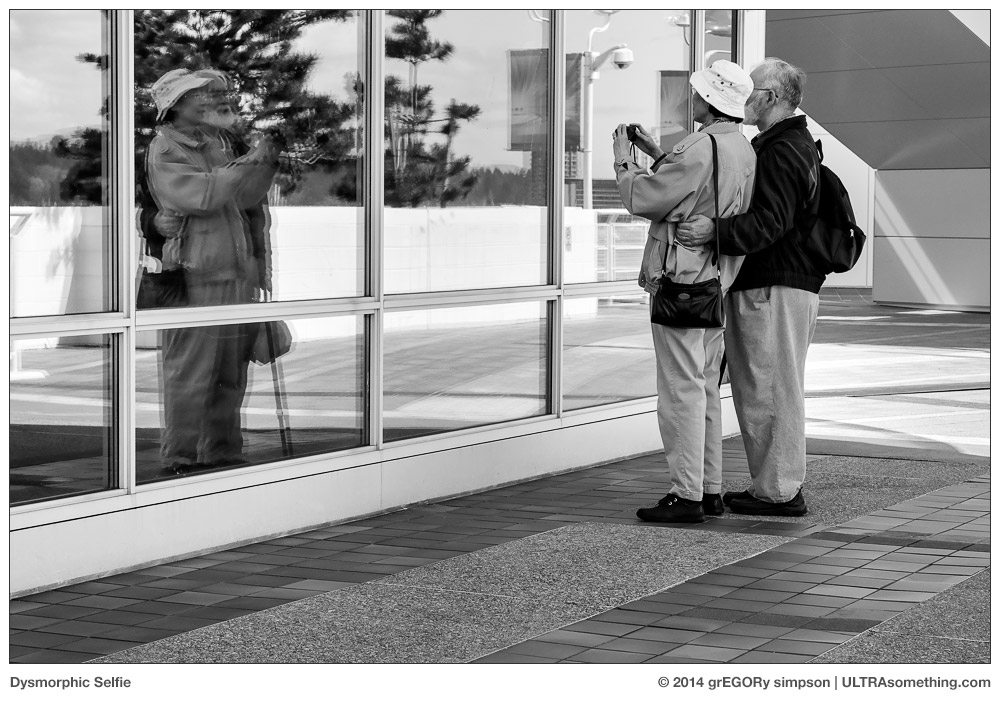
    “Dysmorphic Selfie” was shot with a Sigma DP3 during an afternoon spent valiantly (though ultimately unsuccessfully) attempting to coerce the camera to perform a function it was never really intended to perform — street photography. I chose this image for its (not so) obvious visually metaphoric interpretation of the fidelity aspects of recording an image onto a sensor. “Toward the Light” is just that — an experiment in seeing how well the DP3 handles contra-lighting. “Port-o-Test” attempts to show some of the advantages of the Foveon sensor for BW photography — in what should have been a rather unfair fight, I pitted the DP3 (which has a cropped sensor and 75mm equivalent lens) against my full-frame Leica M9 (fronted with my exquisitely sharp sample of the Voigtlander 75mm f/2.5 thread mount lens). The results indicate exactly why it is I’m anxious to explore the next generation of Sigma cameras in a monochromatic environment. “Houseboats” is simply a throw-away shot taken on my first outing with the DP3 — the full-size version has such extreme resolution and tonal clarity, you’d think it was a stitched panorama — but in reality, it’s simply a crop from a standard DP3 frame.

    If you find these photos enjoyable or the articles beneficial, please consider making a DONATION to this site’s continuing evolution. As you’ve likely realized, ULTRAsomething is not an aggregator site — serious time and effort go into developing the original content contained within these virtual walls.

  • A Treatise on X and Z

    A Treatise on X and Z

    Before Apple amputated the final seven characters from the word internet, leaving only the “i” to designate the latest iThis or iThat product, the hippest letter in the Western world was “e.” Itself a truncation of the word electronic, the letter “e” once ruled the techno-chic roost, giving us words like eCommerce, eMail and eBay — edgy in their time, but now the linguistic siblings of zoot suits and flagpole sitting (go ahead, look it up).

    As a cavalcade of characters take turns basking in their 15 minutes of cultural fame, there remains a pair of classic Western letters that are seemingly always in style. These letters — “X” and “Z” — are every marketing team’s metaphorical little black dress. Need a cool product name? Toss in an “X:” The X Files and X Factor television shows; Leica and Fuji’s duelling X-branded camera lines; Microsoft’s X-Box; the X Games. And do you really think it’s purely accidental that the coolest movies from the late 1960’s and 1970’s were all rated “X?”

    But what if your company decides a particular product is so revolutionary that the letter X doesn’t do it justice? Then you toss a Z in front of it, that’s what: The Kawasaki Ninja ZX motorcycles; the Datsun 280 ZX and Citroen ZX automobiles; the Sinclair ZX computer; Adidas ZX sneakers. If you want to mix things up a bit, just reverse the letters. That gets you such product designations as the Olympus Stylus XZ camera, the HP Pavilion XZ computers and, hippest of all, the Su Group’s XZ Series Gravity Discharge Batch Centrifuges.

    Why are these characters popular? What is it that makes them so cool, and why do they endure? One theory revolves around the fact that they’re less utilized than other characters, thus making their impact more obvious. Another theory is that their location at the end of the alphabet renders them “exotic” to those who were forced to practice their ABC’s in strict sequential order. I have my own counter-theory, which actually focuses on the way the letters appear. Specifically, both the letter X and the letter Z feature strong diagonal strokes.

    The diagonal strokes employed to form the letters X and Z go from corner-to-corner, unlike the diagonal strokes employed in the letters A, K, M, R, V, W or Y — all of which are abbreviated in length. Z features a single corner-to-corner diagonal stroke, while X features two corner-to-corner diagonal strokes (thus explaining why it’s more popular than Z). So what about the letter N? It also features a corner-to-corner diagonal stroke, so shouldn’t it be as popular as Z? The answer is “no,” and the reason for this can be found in its lowercase representation. A lowercase “n” has no diagonal at all, while a lowercase “x” and a lowercase “z” both maintain their corner-to-corner diagonals, and thus their full impact.

    I think this provides irrefutable evidence as to why X and Z are the two hippest letters in the Western world. But even more importantly (and to the supposed point of the ULTRAsomething photography site), this same theory explains what’s happening with my own photographic endeavours.

    For many years, I’ve taken a rather cavalier attitude toward the horizon line. Frankly, I just don’t see why it’s so all-fire important that is runs perfectly level across my frame, and it’s a dictate I first dismissed publicly back in my original collection of Bartlett’s Rejects photography quotes. It’s one of those so-called compositional “rules” that should be enshrined in The Museum of Antiquated Notions — right along with the rule-of-thirds and the slavish dictate that wide angle lenses are for landscapes.

    A few weeks ago, in an article called Fractured, I revealed my intention to explore “fractured photography” — a term I coined for a style that I hadn’t quite defined. Since we’re all an amalgamation of our influences, I mentioned my own inspirations and how it was fairly obvious that my fractured photographs contained elements of both the Provoke era photographers and the Pictorialists. But I still hadn’t figured out how another driving force behind my fractured photography — the Czech avant-garde — was shaping this style. I felt its influence when I photographed, but I couldn’t see its influence in the photos.

    Hoping to draw some parallels between their work and mine, I pulled a Jaromir Funke book from my shelf and began to study it carefully. Bang! The answer was so obvious: Funke appeared to hold the horizon with as much contempt as I do. But upon further examination, I noticed that it wasn’t so much that he was anti-horizon, it’s that he was pro-diagonal. Looking back over many of my photos, I noticed the same thing — diagonals. The answer was right there in the opening two shots of the Fractured article (reproduced below), and yet I failed to draw the connection.

    More and more, I tend to place strong visual elements along the diagonal. It’s not something I’ve necessarily done deliberately and consciously, but rather as means to some other visual end. For example, in the top photo called Spider, I chose to angle the camera because I saw all the various lines extending outward from the central figure, and I realized these line would become more visually obvious (and more web-like) if they didn’t conform to the expected orientation. In the photo called Corner Tableau, I spotted a man watching a woman walk by. His demeanor was the key to this shot, so I knew I had to get his entire body into the frame. But if I exposed vertically, I’d lose the woman. And if I composed horizontally, I’d lose a part of his body — so I composed on a diagonal, thus getting all the desired elements into the photo. Alas, in the spit second it took me to decide this, the man’s attention had shifted from the woman and onto me. Still, in spite of losing the original context surrounding my decision to tilt the camera, the diagonal framing works to instill a sense of unease to an altered narrative, which now casts me as the voyeur, rather than the gentleman.

    So there we have it — a direct link between Jaromir Funke, the hippest characters in the Western alphabet, and my own (albeit non-conformist) photographic proclivities. Maybe I should start calling it FraXured Photography — at least until I figure out how to shoehorn a “Z” into that branding…


    ©2014 grEGORy simpson

    ABOUT THESE PHOTOS: “Spider,” “Corner Tableau,” “Father Figure” and “Vampyr” were all photographed with a Ricoh GR digital camera. “Funke Town” was snapped with an Olympus OM-D E-M1 and a Leica/Panasonic 25mm f/1.4 lens.

    If you find these photos enjoyable or the articles beneficial, please consider making a DONATION to this site’s continuing evolution. As you’ve likely realized, ULTRAsomething is not an aggregator site — serious time and effort go into developing the original content contained within these virtual walls.

  • The Fallacy of Saw

    The Fallacy of Saw

    Our world is awash in myth. So prevalent and pervasive are most myths that most people don’t even give them a second thought. I must admit that I sometimes wish I was “most people,” because the blind acceptance of misconception tends to irk me far more than is psychologically healthy.

    Take, for example, the “what I saw” fallacy. Have you ever opened a photography magazine, and seen a photo that was so overly-processed that you feared it might cause spontaneous macular degeneration? Of course you have — such photos continue to be wildly popular, and are therefore quite ubiquitous. But have you read the photographer interviews that generally accompany such photos? Nine times out of ten, the photographer will inform us that all his Photoshop manipulations were needed to “make the final image look the way I saw the scene when shooting it.”

    Every time I read this hoary old fable, I have a little mini-stroke. I mean, if you want your photos to lacerate someone’s retinas, then go for it. I don’t care. That’s your bag, that’s what you like, that’s what you do, and that’s just fine. But don’t justify it by invoking the “it’s how I saw the scene” myth. Who sees the world in candy-coated colors in which highlight and shadow are one and the same? What kind of fiendish scientist replaced your human eyeballs with bionic cyborg orbs?

    I’ve seen this “what I saw” fallacy employed to explain everything from extreme tone mapping to unnatural color shifts; from artificial depth-of-field enhancements to excessive clarity adjustments; from a savagely wielded cloning tool to the application of an overly contrived spot-color treatment.

    I find such faulty rationale particularly irksome whenever it’s invoked by portrait photographers. What sort of photographer is unable to see a single wrinkle, pore or discolouration on human skin, yet can plainly see the swirls, lines, blooms and pattern in a subject’s iris? Under what bizarre atmospheric conditions is light rendered such that this is “what you saw” when you snapped that impromptu portrait?

    You want to know what I see when I shoot? I see squat, that’s what I see. Frankly, I consider myself lucky if I walk across a room without bumping into any furniture. So I’m certainly not going to be seeing the chartreuse-tinted wingtip of a butterfly at 500 meters — my camera might, but I won’t.

    The first photo accompanying this article is indicative of how most of my photos would look if I showed ‘em as I saw ‘em — or, in this particular case, when I don’t quite see ‘em. I was on the street late one night, when I suddenly became aware of a sinister and rapidly approaching presence. I could hear the heavy shuffling of feet, the laboured breathing, and the swishing of stiff fabric as something bore down upon me. I felt the hairs stand up on the back of my neck, and quickly turned to face (and photograph) the impending danger as it lurched past me — brushing my shoulder before it disappeared back into the darkness from which it came. The photo shown here is, indeed, exactly what I saw — which, I surmise, was likely some sort of troll.

    And what of the banshee photo? It’s obviously been heavily processed, but not for the purpose of accentuating “what I saw.” Rather, I’ve processed it to accentuate what I didn’t see. In this particular case, the fact I didn’t quite see my subject is a good thing, since banshees usually appear only as harbingers of violent death. Much rarer and even more elusive is the male of the species — the banhee. Banhees traverse the space between light particles, making them particularly difficult to photograph. Since I was capable of only intuiting the banhee’s presence, I simply aimed my camera toward the cold spot to my left — hoping some light particles from the visible spectrum would reflect a portion of the banhee’s image onto my camera’s sensor. In order for either you or I to actually see the banhee, excessive post processing was required — bringing out many details, which initially appeared obfuscated in shadow. And isn’t this the real reason for most processing decisions? To enhance subjects beyond the reality of the scene? Beyond what we “saw?”

    Feel free to photograph whatever you want. Process it to look however you want it to look. But if you’re going to make up stories about what you saw, at least make ‘em entertaining. Dragging out the old “this is the way the scene looked to me when I shot it” fallacy is both tiresome and trite — unless, of course, you really do have bionic cyborg orbs.


    ©2014 grEGORy simpson

    ABOUT THESE PHOTOS: “Troll” and “Banhee” were both photographed with a Ricoh GR digital camera — which I’m quickly coming to realize might well be the single best camera available for those wishing to photograph supernatural phenomena.

    If you find these photos enjoyable or the articles beneficial, please consider making a DONATION to this site’s continuing evolution. As you’ve likely realized, ULTRAsomething is not an aggregator site — serious time and effort go into developing the original content contained within these virtual walls.

  • Fractured

    Fractured

    I’m not sure when I first came to realize that the big statistical bell curve of public taste didn’t actually include me.

    Maybe it was during my teenage years. My friends would forever argue over who was hotter, Farrah Fawcett or Cheryl Tiegs. I remained mute on the subject — quietly confident that the answer was “neither,” and that Carol Kane (from “Annie Hall,” “When a Stranger Calls” and “Taxi”) had them both beaten. Never mind that Carol didn’t have a swimsuit poster to promote her “hotness” — her appeal went beyond something that could be tacked on a wall.

    Come to think of it, I might have grasped the situation even earlier — grade school, perhaps. While all my friends were trying to figure out whether they’d grow up to marry Ginger from “Gilligan’s Island” or steal Jeannie away from Major Nelson, I had my sights set on Lily Munster. Now that was a woman worth growing up for.

    But it’s not just a female-related phenomenon. It’s an anything and everything phenomenon.

    Music? I spent my entire adult life involved with the arts (in general) and electronic music (specifically). So you’d probably never guess that “Cowboy in Sweden” — Lee Hazlewood’s loungey, psychedelically-infused, mawkishly addictive collection of tumbleweed pop — would be my all-time favourite album… but it is.

    Movies? With my Top-10 list populated with such titles as Juan Lopez Moctezuma’s “Alucarda,” I doubt it shares many entries with the Top-10 lists of cinephiles residing beneath the bell curve of motion picture appreciation.

    And so it goes with everything — fashion, food, travel, design, philosophy. Name most any topic, and I’m so far removed from the bell curve, I’d have to take a taxi just to get to the long tail.

    Curiously, it’s photography that once provided the lone exception. Granted, I always had a disinterest in the “pretty” photos that occupy the fat juicy center of the curve — the sort of photos that would land a photographer an assignment with some nation’s tourism board, or a studio gig with Farrah Fawcett or Cheryl Tiegs. My heroes had names like Frank, Friedlander, Koudelka, Erwitt, Smith and Winogrand. Thanks to society’s mid-20th century hunger for photojournalism and John Szarkowski’s influential good taste, there was enough room in photography’s long tail for an assemblage of photos that actually spoke to me. These aforementioned photographers (and many others of their ilk) are the ones who taught me how to see and, more importantly, how to communicate what I saw through photography.

    Unfortunately, since the turn of the 21st century, photography’s big bell curve has been shifting steadily away from the metaphorical poetry of the photojournalists and Szarkowski’s “new documentarians,” and toward the pedantic and obvious — images manipulated into idolatry and scrubbed free of character and soulfulness. My position within the fringes of today’s photographic bell curve is really nothing but an anachronistic remnant of photojournalism’s past popularity. As we who continue to appreciate the genre grow old and expire, our numbers decline and our position under the big curve grows more tenuous.

    Truth be told, my position within the bell curve was always more tenuous than I let on. While there was (and still is) a part of me that loves traditional photojournalism, I always had another “side” — a side in which I would be inexplicably moved to take photos that John Szarkowski would have detested, and that my photographic heroes would have mercifully denied with a match and some lighter fluid. It’s a side filled with photos that favor innuendo over fact; photos written in coded riddle rather than lucid prose; photos that reward the quixotic and condemn pragmatism.

    Unlike the photojournalists, who all feast from the same trough and share a similar vision and passion, there’s no single group of photographers to help me figure out exactly why I’m compelled to take the most fractured of images. Or to figure out exactly what it is I’m hoping to achieve by doing so. There’s not even a single genre or designated nomenclature under which these sorts of photos can be grouped.

    There’s an undercurrent of pictorialism, of course. There’s also a smattering of influence from Japan’s “Provoke” era of the early 1970’s. Yutaka Takanashi, Takuma Nakahira, Daido Moriyama — all come close to describing the visual language I seek. But I’m also drawn to early 20th century avant-garde Czech photography. And yet Frantisek Drtikol, Jaromir Funke, Jaroslav Rössler and Josef Sudek often took photos as different from one another as from those taken by the Pictorialists and Provoke practitioners. So what’s the common thread? Where do all these styles intersect? The answer lies buried somewhere in the haze of my own photography.

    I must admit, after a lifetime spent on the outside of every bell curve known to man, I enjoyed the little bit of camaraderie I experienced beneath the long tail of the photography curve. I never felt alone, knowing there were at least a few photographers just like me. It’s what enabled me to create this little slice of photo-existentialism known as ULTRAsomething. I can’t lie — it’s nice to be liked. But the problem has always been that, in order to stay snug and warm beneath the ULTRAsomething security blanket, I had to keep downplaying those anti-fidelity tendencies of mine — those tendencies to create photos that are so far outside the bell curve, they don’t even have a stylistic designation. On occasion, I’ve allowed these photos to grace an article — usually sprinkled amongst a far greater number of “typical” images, so as not to draw a lot of attention to themselves. But I’ve always feared that straying too far from my photojournalism leanings (and the current quasi-trendiness of “street” photography) meant certain exile from the bell curve.

    Maybe it’s the utter revulsion I have for modern commercial photography. Maybe it’s the fact that I can spend hours perusing magazines at a newsstand, and not see a single compelling photograph. Maybe it’s the demotion of the photojournalist to a class subordinate to “dude with an iPhone and an Instagram account.” Maybe it’s that I just don’t care any more. But, whatever the reason, I’ve finally awakened to the realization that I no longer belong within photography’s bell curve and that, by leaving it, I free myself to experiment, find and define the photos that comprise my “other half” — photos that might be a whole lot like the ones included with this article… or maybe not. I don’t know yet. But then that’s the point — it’s time to find out.

    So it’s “¡Adiós!” to the bell curve, and “¡Hola!” to photo obscurity. ULTRAsomething will continue its exploration of so-called “street” photography as long as I continue to explore the streets, but the time has come to give equal attention to exploring my other side — a side that I’m calling, for lack of a better term, “fractured” photography.

    I welcome any and all readers who wish to ride shotgun on this journey. And who’s to say? If 4 or 5 of us can find and define this language, we might just create a tiny little bell curve of our very own.


    ©2014 grEGORy simpson

    ABOUT THESE PHOTOS: The religious innuendo of “Father Figure”; the Murnau-esque suggestiveness of an obsessive “Vampyr”; the three-martini appreciation of “Elegance”; the clandestine and shadowy “Conversation”; the milky luminescence of “Pulse” — all were shot with a Ricoh GR camera. I’ll leave it to you to decide whether they should have been shot at all…

    If you find these photos enjoyable or the articles beneficial, please consider making a DONATION to this site’s continuing evolution. As you’ve likely realized, ULTRAsomething is not an aggregator site — serious time and effort go into developing the original content contained within these virtual walls.

  • Cats and Dogs

    Cats and Dogs

    Simplistic armchair psychologist that I am, I believe that most everyone’s personality — no matter how nuanced or complex — can ultimately be defined and thus predicted through a series of basic either/or questions. Are you a dog person or a cat person? A coffee drinker or a tea aficionado? Mac or PC? Give us humans a choice, and we’ll likely have a pronounced preference. Give us humans enough choices, and our entire personality is revealed.

    It’s a bit like a trip to the optometrist — by asking whether you prefer the view through lens “A” or the view through lens “B,” the technician hones in on a prescription tailored just for you.

    I like to think that a similar tactic works for photography — follow a line of carefully considered either/or questions, and you’ll arrive at your personal photographic core. Once there, you’ll possess the knowledge to not only decide which camera and lenses to purchase, but you’ll even know what you should photograph with them!

    However, as anyone who’s taken a company-sponsored personality test will tell you, the results can only be as accurate as the questions. Ask a stupid question and… well… you know the rest. Most personality tests, I believe, are too flat. Rather than tailoring each question to how the previous one was answered, everyone simply answers the same set of questions — many of which seem more indicative of the test author’s personality than the subject’s.

    My test, which I hope to submit to the little-known and highly-clandestine International League of Enlightened Photographers, would involve more “funnelling” — with each block of questions dependent upon how one responded to the previous block. Obviously, with such a technique, the first question becomes key.

    And it was only recently that I finally determined what that opening question should be:

    “Question 1: Is it the destination or the journey?”

    Curiously, it was my approach to using and enjoying two thoroughly modern, yet completely different digital cameras that lead to this epiphany.

    Olympus OM-D E-M1

    A few years ago, after realizing that the industry had changed and that people were increasingly unwilling to pay (or, at least to pay me) for shots, I ditched all my SLRs — focusing on the sort of photography that I preferred and enjoyed. As a consequence, my big bag-o-camera-tricks has been missing quite a few tools for quite a few years. It’s been without long lenses, macro lenses, shift lenses, fisheye lenses, auto-focus lenses, and lenses adapted from other camera systems. It’s also been without many of today’s so-called “necessities” like video, wi-fi connectivity, rapid frame rates, art filters, multiple exposures, in-body HDR, image stabilization, and super high ISO speeds.

    It struck me as somewhat absurd that everybody and their Aunt Bertha had access to all these basic photo capabilities and yet I, a man who defines himself substantially through photography, did not.

    And so I searched for what would likely become, for lack of a better term, my “Swiss Army Camera.” It would be the camera to restock my capabilities cabinet, but it wouldn’t necessarily be my “go to” camera for the soul-defining projects.

    And it was precisely for this purpose that I purchased an Olympus OM-D E-M1.

    Over the last few months, many eagle-eyed readers have spotted a smattering of Olympus digital shots in some of my posts, and I’ve received dozens of emails asking that I write a review of the camera. It’s a reasonable request. After all, nearly every photo-related website and publication awarded the OM-D their “Camera of the Year” honor for 2013. And while it’s flattering that, with all this existing evidence, some people still want to know my take on the camera, what can I possibly say that hasn’t already been said? The bottom line is this: the camera functions much like a modern digital SLR (in spite of the fact it isn’t actually one), and it does everything that any reasonable person would expect it to do, and it does it reasonably well.

    Frankly, it’s the most boring camera I’ve ever used in my life.

    Hmmm, maybe I do have something “new” to add to this discussion, after all.

    Mind you, “boring” does not mean “bad.” Some of the least boring cameras I’ve ever used are actually the most infuriating — persnickety film transports, light leaks, sticky shutters. Unpredictability is rarely boring, but that doesn’t mean it’s something we necessarily desire in a camera. The Olympus simply works and works well. Like I said, “boring.”

    “Boring” also describes the photos I find myself pulling off the Olympus’ SD card. Since we all know that “it’s the photographer, not the camera,” I’ll be the first to state that the reason my photos from the EM-1 are “boring” is entirely because of me. This is a camera that would excel at photographing your friends at a party, or a lion on safari. It’d be great for scenic vistas at a National Park, or for architectural details in a medieval city. It would effortlessly capture all the action at the local hockey arena, or a bunch of kids running wild at a family reunion. In other words, it’s a camera that’s ideally suited for subjects that I don’t photograph very often or very well. But that’s the point of having a Swiss Army Camera, isn’t it? It’s about having access to a whole set of photographic tools you might not always need, but never know when you might want. Frankly, “boring” is probably a step-up from what usually occurs when I step outside my photographic comfort zone.

    I’ve come to think of the OM-D EM-1 as my “destination” camera. It’s the camera I might pull out of the bag when I get to where I’m going; the camera I’ll use to take a photo to commemorate a trip, event or special moment. Of course, I don’t tend to commemorate trips, events or special moments. That’s just not the sort of photography that interests me. I might even go so far as to say that it “bores” me, which is probably a third reason why I declared this “the most boring camera I’ve ever used in my life.” It actually encourages me to go ahead and take all the sort of photos I wouldn’t normally have any interest in taking.

    Photographically, I’m much more interested in the “journey.” I’m interested in the jumble of life that happens all around me while I’m simply getting to somewhere else. For this, I need something less “Swiss Army” and far more specialized…

    Ricoh GR

    I’ve shot it for only a little over a week, but I already feel completely familiar with the new Ricoh GR. It’s not the sort of camera line that reinvents itself with each new product freshening, because the original designers pretty much nailed it on the first try.

    One of the many things I love about Leica’s M-series cameras is that, once you’ve owned one, you can pick up any model in its 60-year lineage — film or digital — and you’re immediately acclimated. The same is true of the Ricoh GR. Whether you owned one of the original Ricoh GR film series cameras, one of the earlier GRD digital models, or the GXR (like I do), the ergonomics, handling and philosophy are the same.

    Also akin to the M-series Leica cameras, Ricoh GRs have a way of “cutting the crap,” and getting right to the point of photography — particularly if the point of your photography is “the journey.”

    Slim enough to fit into the front pocket of my jeans (with me actually in them), it sports a lens with a 28mm equivalent field of view — my ideal focal length for photographing whatever life throws my way. Elegant in function and austere in appearance, the Ricoh GR puts every control directly where my fingers expect to find it. Furthermore, Ricoh allows even the most obsessive photographer to assign these controls to match their needs precisely. I know people claim the Olympus OM-D EM-1 features a similarly rich amount of customization, and compared to its competition (dSLRs), this might be true — but compared to the Ricoh, it’s not even in the same league. I can completely change functionality on the Ricoh, using only one-hand, in the time it takes to bring the camera to my eye. And yes, I bring the camera to my eye because I can’t stand to frame photos with rear-panel LCDs. So my GR has a tiny Voigtlander 28mm optical viewfinder on top.

    Most of the time, I’m scale-focusing using Ricoh’s fabulous “snap focus” mode. It’s a bit like using the distance scale to focus an old-school manual lens, except you don’t need to employ a second hand to change the focus distance with the Ricoh.

    In those instances when I do use autofocus, Ricoh was clever enough to put the focus confirmation light up high, near the hotshoe. Since I work with my eye pressed to the optical viewfinder and all camera sounds silenced, it’s a huge benefit to see focus confirmation within my peripheral vision. Now, I know what you’re thinking — you’re thinking, “hotshoe-mounted optical viewfinders don’t display any camera information and they don’t correct for parallax. So even if you use center-point autofocusing, how do you know where the true center of the frame resides? How do you know what, exactly, the camera is focusing on?”

    I hate to tell you this, but the answer is the one no one ever likes to hear — because the answer is “practice.” That’s right. Simple, basic, rote practice. I first spent about 30 minutes using the rear LCD to focus on objects at various distances, making note of where those objects appeared in the optical viewfinder. With that knowledge, I then started using the optical viewfinder to guess where I thought the autofocus patch would be. Within a single afternoon, I trained myself to achieve a 100% success rate. It helped that Ricoh was thoughtful enough to center the hotshoe over the lens, so one only needs to practice compensating for vertical parallax.

    The latest Ricoh GR has also inherited my favorite feature from my old Pentax K5 — TAv mode. As every photographer (hopefully) knows, there are only three variables that contribute to photographic exposure: Aperture, Shutter Speed, and ISO (which we used to call “film speed” in the pre-digital days). In the film era, one’s choice of ISO was determined by one’s choice of film, so the camera was responsible for only two of the three exposure variables.

    As cameras became more automated, manufacturers introduced a pair of exposure modes to assist photographers: Av (Aperture priority) mode and Tv (Shutter priority) mode. In Av mode, the photographer sets the desired aperture and the camera selects the appropriate shutter speed. ISO was already pre-determined by the film selection. In Tv mode, the photographer sets the desired shutter speed, and the camera selects the appropriate aperture. Again, ISO was already pre-determed by the film selection.

    Simple, right? You give the camera two exposure parameters and it sets the third based on its internal light meter.

    So now that modern times are upon us, and the ISO parameter has moved inside the digital camera (since it’s no longer determined by film type), why don’t all digital cameras offer a third ‘priority’ mode — one that lets the photographer set both the shutter speed and the aperture, while letting the camera select the ISO? This is exactly what TAv mode accomplishes.

    I know some slick-talking marketing types will tell you that all cameras have this feature, but they don’t. What all cameras have is an “auto-ISO” feature, and most work only in conjunction with either Av or Tv modes. They work by allowing the photographer to specify a range of allowable shutter speeds. If the camera needs to set a shutter speed that falls outside this range, then it will alter the ISO to compensate. This is most definitely not the same thing as saying, “give me f/4 at 1/250 and let the ISO fall where it may.” It might seem like a small point, but when you’re shooting on the street, it’s huge — I need to have control over both depth-of-field and motion-blur. Frankly, I don’t really care about noise — that’s going to be the least important factor in the shot. Ricoh understands this, which is just another reason why I consider the Ricoh GR a true “journey” photographer’s camera.

    I haven’t even mentioned the stellar image quality, the whisper-quiet leaf shutter, the built-in neutral density filters, or any of a myriad other features that make the Ricoh so incredible. All I really need to say is that, because of its size, performance and responsiveness, the Ricoh GR is a camera that is now always with me, no matter what my destination. Whether I’m going to the grocery store, the dentist, dinner or the ATM, the Ricoh is in my hand. Sure, none of these destinations may be the least bit interesting, but the journey almost always is. And that’s what I like to photograph.

    Conclusion

    Modern camera developers can build some truly wonderful products when they put their backs into it. Unfortunately, in today’s disposable-minded society, it doesn’t seem to happen as often as it should. Fortunately, both of these cameras fall squarely into the “wonderful” camp. True, they may have been designed for two entirely different types of photographers, but that’s OK — we’re not all one and the same.

    So what type of photographer are you? Has your life been a series of places, events and achievements, or has it been a richly textured meandering?

    Is it the “destination” or the “journey?”

    Whichever way you answer, I’m rather certain I can recommend a camera for you.


    ©2014 grEGORy simpson

    ABOUT THESE PHOTOS: “In Viscera” was shot with an Olympus OM-D EM-1 fronted with a Lumix/Leica DG Summilux 25mm f/1.4 lens. “From My Window” was shot with an Olympus OM-D EM-1, this time fronted with a 120mm f/2.8 SMC Pentax-M lens via a Voigtlander K Adapter. “False Creek, Vancouver” was also shot with an Olympus OM-D E-M1, now adorned with an Olympus M. Zuiko Digital ED 60mm f/2.8 optic. Everything else was shot with a Ricoh GR: “Pet Friendly” on the way to grab some carry out Indian food; “Branch Manager” on the way home from Costco; “Prelude to a Fracas” on a walk to retrieve my car after the dealer completed its oil change; “The Leaf Stalker” on my way to the grocery store for a jug of milk; “The New Hoodie?” on my way back from the drugstore (both shots in the diptych taken within 1 minute of each other); and “Innocents” on the walk home after dropping my car off for the previously mentioned oil change.

    If you find these photos enjoyable or the articles beneficial, please consider making a DONATION to this site’s continuing evolution. As you’ve likely realized, ULTRAsomething is not an aggregator site — serious time and effort go into developing the original content contained within these virtual walls.

  • How Many Wrongs Make a Right?

    How Many Wrongs Make a Right?

    As children, many of us likely had at least one moment of serial stupidity that caused a parent or teacher to wag their finger and dutifully mutter the platitude, “two wrongs don’t make a right.” Although the intent of this statement has always been perfectly obvious, I still couldn’t help but wonder, “so how many wrongs does it take?”

    Sadly, no one’s ever actually answered this question. Nor, surprisingly, has anyone shown the slightest appreciation at having been asked. Maybe this is why I never outgrew my propensity for doing so many things wrong — perhaps I’m continuing to search for that elusive answer.

    Recently, I had a particularly generous spate of wrongs contribute to the photograph shown above. Allow me to enumerate them, should you wish to duplicate these results for yourself:

    1. Load a camera with film when you actually have no idea what you plan to shoot or when you plan to shoot it.

    2. Neglect to make note of the manufacturer, type and ISO speed of the film you loaded.

    3. Sit the camera on a shelf. Allow one year to pass, then make a wild guess at what’s inside. Assume something like, say, Kodak 400NC color negative film, and enter this into the iPhone app that you’re now wisely using to track which film is in which camera. This way, you’ll remember to always expose it at ISO 400.

    4. Let the camera sit on the shelf for another 2 years, thus guaranteeing that whatever film resides within has well and truly exceeded its expiration date.

    5. Make sure you’re good and woozy with a particularly obnoxious head cold, then choose the rainiest possible day to finally take the camera out for a walk — this will insure that you have neither the energy nor the inclination to care about how messy and horrible your compositions might be.

    6. Since this is a dreadfully dreary day, and since the long-neglected camera just so happens to be a pinhole camera, long exposure times will be necessary. So go ahead and calculate reciprocity values for 400NC film — even if you’re not really certain that’s what’s inside.

    7. Happen upon a pair of abandoned sunglasses, and erroneously assume that the juxtaposition between those sunglasses and the inclement weather will actually register on a fuzzy, wide angle pinhole shot.

    8. Meter the scene. Start the timer on the iPhone, then open the shutter on the camera. At the end of the 90 second exposure, turn off the alarm on the iPhone, but forget to close the camera’s shutter.

    9. Pick up the camera and start moving it around, even though the shutter is still open and the film is still being exposed.

    10. Recognize your error, close the shutter and advance to the next frame — only to have the film jam.

    11. Take off your raincoat and wrap it tightly around your forearm and the camera, fumbling beneath the damp and constricting nylon to unscrew the camera’s back and fiddle with the film transport — most assuredly fogging the film in the process.

    12. Consider retaking the photo, only to notice upon closer inspection that the glasses aren’t actually sunglasses, but 3D TV viewing glasses.

    13. Walk around in the driving rain to finish the roll, then extract it from the camera to find you’ve actually been shooting Ilford FP4+ ISO 125 B+W film and not Kodak 400NC ISO 400 color film. Shrug it off and hope that your now erroneous reciprocity calculations compensate for (rather than compound) your exposure errors.

    14. While still wearing wet clothes (courtesy of your mid-downpour jacket removal), pop the film and tank into the changing bag, where your wet hands and sleeves cause the film to stick to your fingers, making you screw up loading the reel… many, many times over.

    15. Develop with a solution of Rodinal that’s so old it’s now indistinguishable from industrial-grade maple syrup.

    16. Reach for the fixer, only to remember at this precise moment what it was you forgot to buy while you were in the camera shop last week. Resort to using the last bit from an old jug that expired 7 months ago.

    17. Wash film, then drop it on the shower floor when hanging it to dry. Re-wash film.

    18. After film dries, drop it on the floor under your chair, then roll over it (twice) in your haste to pick it up before the “3 second rule” causes it to collect any dust.

    In the end, I somehow wound up with a shot that I sort of like. Maybe it’s precisely because of the jumbled composition, the strange fogging, the eccentric exposure and the dubious development. Maybe it’s because of the scratched and dusty scan or the obtuse observations of a fevered mind. Or maybe it’s simply because, by all rights, it’s a photo that shouldn’t even exist. Most likely it’s all these things. So apparently the answer to the question, “how many wrongs make a right?” is “18.” Unless, of course, it was wrong of me to post this photo.


    ©2014 grEGORy simpson

    ABOUT THIS PHOTO: “Shades” was shot with a Vermeer 6×6 pinhole camera on FP4+ and developed in Rodinal 1:50. I suspect neither Czarey Bartczak (who makes the Vermeer camera), nor Ilford (who makes FP4+) nor Blazes Photographic (who makes my Rodinal solution) will be contacting me to use this photo in any of their advertisements. C’est La Vie.

    If you find these photos enjoyable or the articles beneficial, please consider making a DONATION to this site’s continuing evolution. As you’ve likely realized, ULTRAsomething is not an aggregator site — serious time and effort go into developing the original content contained within these virtual walls.

  • One

    One

    Why is this called One? Because it’s a project that started with one idea: Put one lens on one camera and go out one afternoon in search of one subject to photograph. Then, using only one purely analog synthesizer (capable of playing only one note at a time with but one oscillator), compose a complete score. Combine that score with the photos to create slightly over one minute’s worth of brow-furrowing trippy madness. Release it to the world on day one of the new year, and see if one person, somewhere, anywhere, actually enjoys the result…

    One from grEGORy simpson on Vimeo.


    ©2014 grEGORy simpson

    ABOUT THESE PHOTOS: Everything was shot with an Olympus OM-D E-M1 using an Olympus 60mm macro lens. All sound design was done on an Arturia MiniBrute analog synthesizer, and recorded one-note-at-a-time into a multitrack recorder — old school, early-1970’s synth-pioneer style.

    If you find these photos enjoyable or the articles beneficial, please consider making a DONATION to this site’s continuing evolution. As you’ve likely realized, ULTRAsomething is not an aggregator site — serious time and effort go into developing the original content contained within these virtual walls.

  • The Ponce Factor

    The Ponce Factor

    Carollers are carolling, partiers are partying, and capitalists are capitalizing on the wallet-wresting effects of garish ornamentation mixed with insipid music. Yes, it’s the Holiday season.

    We photographers are no less immune to these mawkish manipulations than those who partake in most any other hobby. And it’s quite likely that many of us have already populated our Holiday wish lists with all manner of desirable goods — each of which, we hope, will hasten our ascent to photographic nirvana.

    A new camera is likely to top many such lists — a sleek body’s unfamiliar contours and mysterious buttons are a time-tested motivator for photographers seeking renewed inspiration.

    Other lists are likely adorned with one or more new lens selections. When we view the world through the altered perspective of a different focal length, all our hackneyed old subjects suddenly appear fresh and compelling.

    Clever (i.e. “older”) photographers — who have now shot their usual subjects with 37 different cameras and a lens assortment numbering in the hundreds — will usually add “travel” to their Holiday wish lists. Nothing inspires one to reach for photographic nirvana quite like the experience of having something genuinely new to photograph.

    Introspective photographers might feel the urge to add some nice photography monographs to their list. After all, discovering creative new ways to interpret familiar subjects can be every bit as liberating as actually finding new subjects.

    So what’s on my photographic Holiday wish list? What’s going to drag my butt up Mount Nirvana?

    Clothes.

    Yes. That’s right. Clothes. And I’m not talking about such absurd accoutrements as photo vests or those silly harnesses you strap to your body to help secure your camera. I’m talking about your basic, run of the mill, everyday clothing.

    Now I must admit that new clothing doesn’t work in quite the same way as a new camera, lens, travel destination or photo book. Those purchases are all designed to cause an effect — better photographs. New clothing, on the other hand, is the result of an effect. Specifically, new clothes are the result of better photography.

    Perhaps I should backtrack…

    About three months ago, I altered my diet and exercise routine. I stopped eating glutens and significantly reduced my carbohydrate intake. I also added 30 minutes of aerobic and anaerobic exercises to my daily workout routine, thus increasing it to… well… 30 minutes.

    Curiously, I didn’t do this because I considered myself to be either unfit or overweight. Over the last two decades, I gained about a pound a year — a nearly imperceptible rate of change, and one which I readily dismissed as “the inevitable result of aging.” Cloaked in such denial, it would obviously require a rather potent impetus for me to willingly forgo such indulgences as bread, beer, pasta and pastry — and that impetus was migraines.

    For over 30 years, I’ve suffered through frequent, protracted and debilitating migraines. Every new pill, procedure, lifestyle change or bottle of snake oil gets my rapt attention. So when I read that a common benefit of a gluten-free diet was a reduction in the frequency and severity of migraines, I took action.

    Within days of my gluten banishment, a strange thing happened: the digital readout on my bathroom scale began to display steadily declining numbers. Suspecting a faulty battery, I swapped it for a new one. The decline continued. Encouraged by this and by an increase in my energy levels, I started reading some health and nutrition books. One in particular, called Grain Brain, filled me with a terror far greater than any horror novel, and provided the necessary incentive to stick to my routine during those early days. Soon, it wasn’t fear that motivated me, but success. I grew lighter, healthier and happier. And as I did, I would go out for increasingly longer photo walks. No neighbourhood was too far; no day too rainy; no morning too foggy; no night too dark and cold. I realized how lazy I had recently become, and how this laziness translated into a lessened and compromised photographic output.

    It took two decades of denial and ignorance for my weight to peak at a full 9 pounds above a healthy, normal BMI range — a statistic I spent the last year leniently assuming meant I was “just barely overweight.” In contrast, it’s taken a mere three months for me to lose 15 pounds, which puts me back comfortably within the “acceptable” BMI range for my age and height. But as with most things I undertake, “acceptable” isn’t good enough when “superlative” is within reach. And “superlative,” according to an amalgamation of various ideal-weight formulas, means I still need to lose another 10 pounds — which, when achieved, will put me at the same weight I was at in my early-20’s.

    I felt pretty darn good in my early-20’s. Looked good too… had endurance in spades…

    Making these lifestyle changes has been ridiculously easy. And the benefits — not just to my photography, but to my overall well-being — are demonstrable. Going gluten-free has eradicated my excess weight, eliminated my frequent and varied collection of digestive “issues,” and infused me with enough energy to grab a camera, head out the door and take the time to explore and experiment. The only real problem is my clothing. Nothing fits me anymore. At least not the way I intended. My tailored shirts billow and flap about like a tarp in a hurricane. My tight rock ’n roll jeans have gone hip hop — slipping south of my waist, where they’re now held aloft only by the remnants of my butt and a belt cinched to its minimum circumference. Its excess length wags before me, to-and-fro, like some sort of leather dowsing rod. In another few weeks, I won’t even be able to pull off the “hip hop” look. Instead, I’ll be sporting the “senile old man with his pants around his ankles” look…

    In fact, the only thing that my new gluten-free lifestyle hasn’t improved upon is the very thing that inspired it — the migraines. They seem, thus far, to be relatively unaffected. But in spite of this, I still feel as if I’ve stumbled upon the fountain of youth. Which is good because, if I live forever, the odds I might one day take a decent photograph increase substantially… and all it would have required is some new clothes.


    ©2013 grEGORy simpson

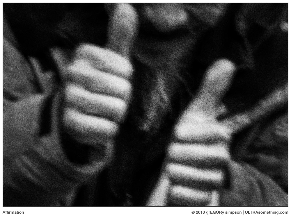
    ABOUT THESE PHOTOS: “Affirmation” was shot with an Olympus OM-D E-M1 with a Lumix/Leica DG Summilux 25mm f/1.4 lens. “Undulate,” another example of my continuing diptych compulsion, was shot with an Olympus Pen FT and an Olympus 25mm f/4 lens on Kentmere 100, exposed at ISO 50 and developed 1:50 in Rodinal. “Flashers” was taken on one of those foggy mornings mentioned in the article. It was shot using a Hasselblad XPan with a Hasselblad 90mm f/4 lens on FP4+, exposed at ISO 250 and developed in Diafine. “Fountains” — another diptych, this time chosen for its sheer blatancy — was shot using an Olympus Pen FT with an Olympus 38mm f/1.8 lens on Tri-X, exposed at ISO 1000 and developed in Diafine.

    If you find these photos enjoyable or the articles beneficial, please consider making a DONATION to this site’s continuing evolution. As you’ve likely realized, ULTRAsomething is not an aggregator site — serious time and effort go into developing the original content contained within these virtual walls.

  • The 8% Solution

    The 8% Solution

    70%. Back in my University days, this was the percentage of test problems that I and my fellow engineering students needed to solve correctly in order to pass a class. For those subjects with which I had an affinity (like Hybrid Microelectronics or Analog Filter Design), the 70% rate wasn’t overly onerous. But subjects such as Satellite Communications and Particle Physics didn’t dance to the same beat that pulsed the synapses in my brain. To achieve the required 70% success rate, I’d miss meals, abandon inter-personal relationships, and skip many a night’s sleep. Most times, I’d just barely squeak by — emaciated, friendless and quasi-narcoleptic — but wearily happy to have achieved the seemingly impossible 70%.

    70%. The corporate world seemed to demand a similar performance. Every month or so, management would toss two or three assorted problems at me, and I’d concoct some sort of solution. Employees who were able to successfully resolve 7 out of 10 problems usually got to keep their jobs. Those with a lower rate of success were inevitably swept away in the next company “reorganization” — the corporate equivalent of apoptosis.

    100%. That was the success rate required once I stopped working for large corporations, and moved into the invigorating world of startup companies. Startups have no room for error. One product miscue and you’re out of business. One wrong decision, one offended customer, one botched marketing campaign, one fatal software bug, one mistake of any kind — and your company would vanish. I lived like this for nearly 20 years — never sure, from day-to-day, if I’d still have a job the next morning.

    8%. That’s the decadently luxurious success rate imposed by the life I’m leading now — the life of a photographer. That’s right, all I ask is that 8% of my shots be successful. A measly 8%. That works out to 3 shots per roll of 36 exposures. Even more lenient are my Widelux and Xpan cameras, whose extra-wide negatives insure that only two decent shots need occupy each completed roll. Should I snap off two good frames on a roll of 120 threaded into a 645 camera, I’m a bona fide overachiever. And only a single successful shot is required each time I spool a roll through one of my twin lens reflex cameras.

    How do I get away with being so unambitious? Surely an acceptance rate of only 8% would embarrass even the most dyed-in-the-wool slacker. So why am I happy with this?

    Let’s look for the answer through a wider lens… Think of some legendary photographers that you admire. I’m not asking you to think about the ones you’re obsessed with — the ones whose books you spend hours caressing, analyzing and plagiarizing — I’m talking about photographers whose work you respect and know, but haven’t necessarily turned into a religion. How many of their photos can you remember off the top of your head? 5? 10? These are photographers who spent their lives building everlasting fame on the strength of their photographic output, and yet you — a so-called “photography enthusiast” — can only recall a handful of that output. Let’s assume this photographer worked for 30 years. If 10 of their photos impressed you enough that you can recall them sight-unseen, that averages out to one shot every 3 years. Three years they slave — dedicating their lives to their vision — just so you can remember a single photograph.

    Now we see why Ansel Adams said that “a dozen photos in any one year is a significant crop.”

    So let’s return to my slovenly slacker desires — my 8% solution. Truth of the matter is, I’m a very sparse shooter. At maximum pace, I tend to run roughly 1 roll of film through a camera each week — itself an appallingly slack quantity of photos, I know. That means I’m shooting only about 50 rolls of film in a year. Since I shoot mostly 35mm, that works out to around 1800 photos in a year. 8% of that number is 144 photos. 144 good photos… in a year! Chew on that Ansel. Now who’s the slacker?!

    Unless you’re fulfilling the needs of a client — and that’s fewer and fewer of us photographers these days — you’re shooting for yourself. Ostensibly, you do this for fun. So where’s the finish line? What’s the rush? Is your goal to shoot a lifetime’s worth of photographs within the next 6 months, then move on to a different hobby? I’ve known many photographers who get quite discouraged if they go out for an afternoon and don’t come back with at least a dozen new photos for their portfolios. Why all the self-imposed pressure?

    Smell the roses. Caress the scene. Try new things. Push yourself. Take chances — after all, you’re free to fail 92% of the time. 30 years from now, you’ll still have amassed 4320 photos you’re happy to call your own.

    When all is said and done, and you sit down to assemble your comprehensive, career-capping photographic anthology book, you’ll have 4320 photos from which to choose. Even if you decide to include only the best 8% of that overall 8%, your magnum opus will still contain 345 memorable photographs. What photographer wouldn’t want that as a legacy?

    8%. Now that’s living. Ain’t photography grand?


    ©2013 grEGORy simpson

    This article (along with many of its associated comments) first appeared in my f/Egor column for the Leica Camera Blog on November 12, 2013.

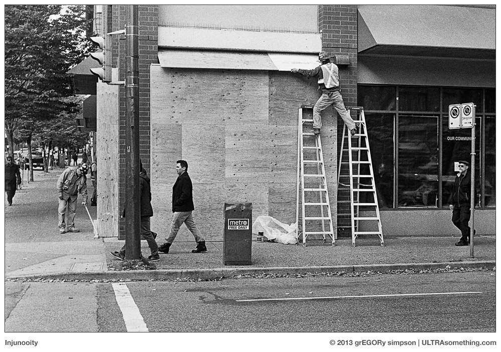
    ABOUT THESE PHOTOS: For the purpose of pedantic illustration, I’ve included six shots with this article — three each from the two rolls I shot last week while testing my newly reconditioned 1948 Leica IIIc (thus deftly tying this article to the Leica blog, for which it was originally written). The following variables might be of interest to a (very) few: “Injunooity” and “Prescience” were photographed with a 50mm f/3.5 collapsible Elmar lens on Tri-X at ISO 320, and developed in a 1:50 solution of Rodinal. “Vansterdam” was also shot on Tri-X at ISO 320 and developed in Rodinal, but employed a 35mm f/3.5 Elmar instead. “Lawless,” “Pay Here” and “Omega Man” were all photographed with a 50mm f/2 Summar lens on FP4+ at ISO 250, and developed in Diafine. Also, it should be noted that my 8% target applies to film photography only. When I shoot digitally (which, coincidentally, I did only 8% of the time this year), my acceptability target drops so low as to be both immeasurable and, I suspect, a wee-bit unhealthy.

    If you find these photos enjoyable or the articles beneficial, please consider making a DONATION to this site’s continuing evolution. As you’ve likely realized, ULTRAsomething is not an aggregator site — serious time and effort go into developing the original content contained within these virtual walls.

  • Littlefields

    Littlefields

    This article is going to be a little bit different than most — it’s not going to be all about me. Mostly about me? Of course! But all about me? Nope.

    Ostensibly it’s an article about Littlefields Photography Magazine, which is edited and published by my friend Jim Clinefelter in Portland, Oregon. But it’s also about photography as a whole — and about how we view and consume photography in today’s digital, web-centric world.

    For many of us, a “magazine” is something that contains a hundred or so pages of shiny, ridiculously thin paper bound together like a book, and sold at newsstands or at the corner market. We might think of Vogue, National Geographic or Sports Illustrated. Or, more apropos, we might think of Popular Photography, Photo District News or Aperture.

    In reality, this is a very limited and restrictive definition of the word “magazine.” Historically, a magazine is defined simply as a container for a related collection of objects. As tablet users know, magazines don’t necessarily need to be bound like books, nor even printed. To an iPad owner, a “magazine” is a collection of articles, photos, videos and advertisements bundled together within a single digital download. For a gun aficionado, the word “magazine” takes on an entirely different context — as something that holds a collection of bullets.

    So when I tell you that each issue of Littlefields Photography Magazine is actually a collection of ten unbound 4×6 prints housed in a hand-made envelope ensconced within a custom-made sleeve, you shouldn’t be surprised. It might not bear much resemblance to that five-year-old issue of People Magazine in your dentist’s waiting room, but that doesn’t make it any less of a magazine.

    Further challenging the popular definition of “magazine” is the fact that the ten unbound photos within my issue of Littlefields might be completely different than the ten unbound photos contained within your issue. That’s because Jim doesn’t just assemble 10 photos for each issue — he assembles 20. Or 40. Or 60. Each magazine is therefor a random collection of 10 photos drawn from a larger pool of photographs, all designed to play upon a particular theme. Based on the laws of probability, this means each issue is likely unique from every other issue (or at least rarely duplicated).

    So what sort of photos are in each issue? That depends on the issue. Right now, I’m looking at Issue Number 7, which is called “Oregon III” and features photos taken by Jim himself. The photos appear to mostly depict the quirky assemblage of buildings, houses, vehicles, structures and storefronts that populate the equally quirky town of Portland, Oregon. There’s a healthy dose of Eggleston to this particular collection, mixed with a dash of New Topography, and topped with a fresh dollop of whimsy. Because the photos are unbound, you can view them in any order you choose — and the order you choose seems to affect the meanings you extract from each photo (as well as from the collection). I like this aspect of Littlefields, since it speaks somewhat to the techniques I explored in creating my “Masquerade” vBook, which I discussed in the Reject Intent article.

    Other issues of Littlefields address other topics, and several issues feature the works of photographers other than Jim. Some photos may appeal to your aesthetics, and some may challenge them — but all are intriguing. And each image reveals more of itself through repeated views, just as each collection reveals more connections with each reshuffling of the deck.

    The first question most people ask when they hear of a product like Littlefields is, “Why would I want to pay to see a periodically published, curated collection of ten printed photographs when I can look at ten million uncurated photos on Flickr every day for free?”

    To me, the answer is obvious — and the fact that such a question needs to be addressed sits at the root of what’s wrong with the way we consume photography in this second decade of the 21st century. Essentially, it’s a topic I’ve poked at in at least 50 different ULTRAsomething articles throughout the years. So in the interest of (relative) brevity, the following two sections will illuminate just two of the many reason why we need publications like Littlefields.

    A Song Is Not a Gallery of Pretty Notes

    Photography is more than a visual medium — it’s a language. It’s poetry. It’s music. Looking at a sampling of photos on the web is like reading randomly selected words from the dictionary and calling it a novel. It’s like listening to individual musical notes without the context of harmony, counterpoint or rhythm.

    As I once discussed in More Poe than Van Gogh, one of the greatest disservices to photography is that it’s more closely associated with painting than with poetry. I believe photography is at its most powerful when it’s sequenced and assembled into collections. I believe its true potential is revealed when we establish connections between photos and that, like poetry, it’s most enjoyable when these connections are tentative, malleable and open to interpretation.

    A collection of photos chosen for their connections and implications can be so much more powerful than a collection of photos chosen in isolation. Choosing two “lesser” photos may, in fact, provide greater impact than choosing one “better” photo. Photo editors and curators understand this. They know how to let photographs “breathe.” They know that when different types of photos come together and juxtapose, they create new emotions and a different energy level than would be achieved by a single image, or by a lump sum of miscellaneous “best” photos uploaded to an online gallery.

    Consider this: If every member of a symphony orchestra played a “C” note, it would sound quite nice — a rich and beautiful note. If every member of the symphony orchestra played an “Eb,” it would sound equally rich and beautiful. Yet neither performance would elicit much of an emotional response. The orchestra could play a “D#” or it could play an “E.” The result would be the same, and the audience would quickly grow bored.

    But what happens when the orchestra combines notes? What happens when half the orchestra plays a “C” while the other half plays an “Eb?” Suddenly, the listener might feel some kind of emotion — perhaps a sense of melancholy (since minor thirds are often used to suggest ‘sadness’ in music). If half the orchestra plays a “C” while the other half plays a “Db,” the listener might suddenly become irritated or edgy since these two notes create a harmonic dissonance. If half the orchestra then played a “C” while the other half played an “E,” the listener might feel a sudden sense of relief, since the tension between the previous two notes had been resolved, and the resulting major-third interval is a ‘happy’ sounding interval.

    The combining of notes — along with their sequencing and pacing — are how composers create music with emotional impact. And it’s no different with photography. It’s why photos need to be edited, curated and sequenced. I believe that viewing a random selection of photos in an online gallery is no more soul-satisfying than listening to someone play a random note on a piano once every beat. And it doesn’t make any difference if that random selection of photos is of the highest quality or not — it won’t make their emotional impact any stronger. If you use a $175,000 Bosendorfer Imperial Grand to play a single, random note once every beat, it’s not going to sound nearly as good as a $900 tattered old Baldwin spinet piano on which someone plays a collection of sequenced notes curated by, say, Bach.

    Photography Demands Tactility

    Historically, a photograph has always been a THING — an object you hold in your hand, hang on a wall, or bind into a book. Only recently has photography become DATA — something you view on a computer screen. I assert, plain and simple, that this is the absolute least satisfying way to view a photograph.

    Clever readers may think I’ve written myself into a paradox. After all, I argue that photography is best approached as a form of poetry or music, yet an appreciation of poetry doesn’t require that it be read on a printed page. Nor does an appreciation of music demand that it stream forth from a vinyl album or CD. So how can I possibly assert that a photograph needs to be printed in order for it to be fully appreciated?

    And my answer is this: looking at a photograph is a more interactive experience than these other endeavours. Photos change appearance under different lighting conditions — something which does not occur with a backlit computer screen. Similarly, the texture and characteristics of the paper on which a photo is printed will greatly affect the mood and emotion of a photograph (much like the choice of musical instrument changes the feeling of the tune that’s played). The very touch of the paper on which it’s printed can alter one’s perception of a photograph, as can the printing method one chooses. Printed photographs have far greater resolution than those viewed on a computer monitor — even those printed digitally. For example, an 8×12 print made on my Epson 3880 has 360 dots per inch, meaning there are 12.5 million pixels defining that image. That same photo, displayed at the same 8×12 size on a computer monitor, is made up of only a half-million pixels — a mere 1/25th the resolution of the print (and fraught with all the downsampling artifacts and issues inherent with removing 96% of the image detail from a photo).

    Computer monitors and tablets are very rigid in how one must interact with the content they display. For example, most photographers exhibit their images in online galleries — but only the most dedicated of viewers will likely see every image in the gallery. If a photographer chooses images so that their juxtapositions tell stories and create emotions, their efforts are lost on anyone and everyone who randomly clicks on only a few of the photos. It’s no different than if someone reads only a line or two of a poem, or listens to a few seconds here-and-there of a symphony. Even if someone does manage to sit through every image in an online slide show, the image sequencing is static and the timing is rigid. Pacing and rhythm (a key element in poetry, music and photography) is lost. This is the reason why, when I do publish a collection of my own photos online, I now try to do it in my new vBook format (as shown in the earlier link to the article about Masquerade, or in 47 Photos of Rain).

    Also, when viewing an online gallery, people are often distracted by something else — an email coming in; a friend’s Facebook post; a link they saw on the gallery web page. Viewing printed photos is a committed act, and commitment yields satisfaction — particularly if we really do consider photography as a form of poetry, where time and effort are needed to absorb what the images mean to you and how they make you feel.

    Hope For the Future

    Like a morbidly obese glutton who consumes food so rapidly that he neither tastes it nor enjoys it, so too does our society gobble up online imagery. With a flick of the finger, an image appears on our smart phone. And with another flick it’s gone. Forever. Consumed and disposed. A vapid snack of hollow calories. Like a piece of candy. Eye candy. Anti-nourishment for an atrophied brain.

    Publishing a small, independent photography magazine within our culture of visual superfluousness is, perhaps, one of the most radical acts a photographer could take — yet it’s an act rooted firmly in tradition. In fact, Littlefields is pretty darn similar to the model Alfred Stieglitz used when he edited and published Camera Work Magazine between 1903 and 1917. Camera Work is an icon — a photo classic and an artistic statement that continues to inspire, influence and divide photographers 100 years later. I’m not creative enough to imagine a world in which a photographer — who only uploads photos to an online gallery — will be held in similarly high esteem 100 years from now. And that’s because I can’t imagine a world in which the ephemeral nature of the internet will allow these photos to survive, much less register any sort of lasting impact.

    Three years ago, I began to work on the concept of creating a photography magazine of my own. Two years ago, I designed the magazine, defined its purpose and created a maquette. Today, it remains an unrealized dream — a project I hope to undertake “if the world ever changes.” Well, guess what? The world isn’t going to change unless people like you and I help it to change. Jim Clinefelter’s already started. His Littlefields Magazine (and others of its ilk) fill me with hope for the future of photography, and with the inspiration I need to finally begin publishing that photography magazine of my own.

    Of course, having now announced my intentions in writing, there can be only one of two possible outcomes: Either 1) I’ll be forced to make good on my plan to begin self-publishing a photography magazine, or 2) that same internet ephemeralness — the one that will render us all irrelevant in a few years — will also dictate that everyone who reads of my intentions will completely forget I ever wrote them…


    ©2013 grEGORy simpson

    ABOUT THESE PHOTOS: Although the photographs of Littlefields Magazine were all shot by me, I claim no responsibility for the content depicted. That’s because all of it — the design; the handmade sleeve; the calligraphy on the cover of Issue 7; the photos themselves — are all the creation of Jim Clinefelter.

    ABOUT LITTLEFIELDS: I am not affiliated with Littlefields in any way, nor do I receive any ‘kickbacks.’ I just happen to admire photographers who go their own way — particularly when they’re going the same way I hope to go. Littlefields subscription rates are as follows:
    5 issues for USD$60.00 (North America); USD$80.00 (Europe and Asia).
    Individual issues are USD$15.00 (North America); USD$20.00 (Europe and Asia).
    Payment can be made via Paypal. Anyone wishing to purchase copies (or seeking further information) should send an email to “littlefieldsmagazine at gmail.com”

    If you find these photos enjoyable or the articles beneficial, please consider making a DONATION to this site’s continuing evolution. As you’ve likely realized, ULTRAsomething is not an aggregator site — serious time and effort go into developing the original content contained within these virtual walls.

  • Multitasking

    Multitasking

    Sure, I’m famous. Wildly so. It’s the inevitable result of writing a website that careens schizophrenically between existentialism and nihilism, and that delights in discussing ancient film cameras and niche products, rather than popular modern photo offerings. But just because I employ a small community of servants, use various classic Bugattis as nothing more than glorified rolling camera cases, and breed my own genetically-engineered flying dogs, that doesn’t mean I don’t have obligations. I am, alas, just like everyone else in this regard.

    Take today, for example. I have a few spare minutes available before I rush off to a training session for my upcoming Russian space tourism flight — a perfect opportunity to cross another mundane task off my to-do list. But which pressing demand should I address first? Should I catch up with emails and other correspondences? Or should I craft another entry for the ULTRAsomething website?

    And then it occurred to me — why not do both? Thanks to my soaring online popularity, there’s a strong likelihood that everyone to whom I intend to send an email or letter is likely an ULTRAsomething reader. So why not kill two birds with one stone, and publish all my personal letters on the website?

    So without further ado…..


    Dear Leica,

    Could you please reconsider your whole “slave to tradition” design conceit? Specifically, could you dispense with the anachronistic baseplate that covers the battery and memory card compartments on your digital M series cameras?

    Keep in mind that the crazy gene knows no boundaries — thus, any customer who’s crazy enough to buy a digital M-series camera is likely crazy enough to still be pushing Tri-X through an older M-series film body. The fact that my M9 looks so similar to my M6 has twice resulted in fogged film — the inevitable result of accidentally removing the baseplate from an M6 when I really meant to simply change the battery in the M9.

    Thanks for your consideration,
    – egor


    Dear Sony,

    I had that dream again — the one where I inadvertently go to school naked, only to find there’s a pop quiz in geometry class and I haven’t studied.

    Following the advice of my personal psychiatric team, I’ve taken to wandering the streets naked —  an act I’m told will cure my vulnerability phobia, and thus the impetus for these dreams. During my subsequent 30-day incarceration for indecent exposure, I had time to address the second half of my dream — diligently studying an old high school geometry book from the prison library. At last, I’m now fully prepared for all nocturnally-administered pop geometry quizzes.

    Because of my studies, I have uncovered a major design flaw in your digital camera sensor design! Apparently, camera lenses create circular images, yet your sensors are rectangular. This means that a large portion of the image data actually goes unused. Might I suggest you manufacture a round sensor, instead? If this proves too eccentric, my calculations indicate that a square sensor would actually give photographers 8.5% more imaging area than a 3:2 sensor designed to conform to 35mm standards. Not only that, but my personal chiropractic team has suggested that a square sensor would alleviate the need to constantly contort my body every time I want to take a photo in portrait-orientation. With a square, there’s no such thing as portrait or landscape orientation! Besides, it’s just so “classic.”

    Note that I don’t actually own any Sony cameras, but since your company currently makes the lions’ share of digital camera sensors, I figured I’d send the idea to you. Should your engineers require any assistance, the aforementioned geometry textbook is available in the Vancouver City Jail. For your convenience, I’ve bookmarked the relevant pages. Ask for either “Snitch” or “Nine Fingered Sam,” and they’ll set you up.

    Thanks,
    – egor


    Dear Mr. Friedlander,

    My eternal gratitude for constantly reminding me that photography is fun.

    – egor


    Dear Director of Marketing,

    I’m glad you liked my marketing proposal, and that you recognize the invaluable contribution my writing, photography, music and reportage would make to your corporate image. However, you may need to look up the meaning of the word “invaluable,” because I don’t think it means what you think it means — otherwise you wouldn’t have asked me to perform this function for free. Therefore, I must humbly decline your offer of indentured servitude and poverty.

    (not so) Respectfully,
    – egor


    Dear Fate,

    I just wanted to send you a quick note of thanks for always being there when I need you. Like, say, when I’m stuck in a banality rut and you deliver a well-timed failure to my camera’s transport mechanism — thus reminding me that literalism is not, nor has it ever been my goal. How will I ever repay you?

    – egor


    Dear Mr. Cartier-Bresson,

    I hate to disturb you in the afterlife, but have you seen what’s become of photography? Is there any chance that you and some of your buddies could get together and haunt the various photo sharing sites? Nothing too spine-tingling or blood-curdling is required — just a bit of supernatural intervention. For example, if someone uploads a photo with ridiculously over-amped micro-contrast, you could aggressively and awkwardly crop it. Or perhaps, each time someone snaps an iPhone photo of their lunch, applies a trendy retro filter and uploads it to Instagram, you could add them to another telemarketing list — thus insuring their iPhone rings every time they try to photograph dinner. And I don’t think it would be too unreasonable to delete the contents of someone’s hard drive whenever they post more than 300 photos from a single, mind-numbingly platitudinous event like, say, a friend’s birthday luncheon. Of course, these are just suggestions — I don’t pretend to be an expert in haunting, so I’m sure you’ll come up with something.

    Think about it.

    Your fan,
    – egor

    P.S. Please say “hello” to Thelonious Monk for me. I still owe him an email about the current state of popular music…


    Dear Adobe,

    Here’s an idea: Since many of us only ever need to use 3 or 4 programs from your entire Creative Cloud suite, how about a “name-your-own-bundle” package that provides a subset of Creative Cloud services for a reduced price? For many of us, this would leave us with enough money in the monthly budget to actually pay the electric bill…

    Your customer since Photoshop v1.5,
    – egor


    Note to self:

    Never lose the ability to find delight in everything that surrounds you.

    – self


    Dear Mr. Jones,

    Thank you for your recent inquiry. In answer to your question about whether I’m a right-eyed or left-eyed shooter, the answer is “neither.” I thought that would have been obvious.

    – egor


    Dear People of Earth,

    Keep doing exactly what you’re doing. Thanks.

    – egor


    ©2013 grEGORy simpson

    ABOUT THESE PHOTOS: “Dear Leica” was shot with a Leica M6TTL and a v4 35mm f/2 Summicron on FP4+ at ISO 250 and developed in Diafine. Fogging courtesy of the “problem” mentioned in the letter to Leica. “Folly” was shot with a Leica M9 and a v4 35mm f/2 Summicron, then obliterated in a fit of ill-conceived Photoshop mania. “Fate” was shot with a Leica R4 and a 50mm f/2 Summicron-R on Kentmere 100 at ISO 100 and developed (inappropriately) in Diafine. “Delight” was shot with a Leica Monochrom and a 28mm f/2 Summicron. “Thanks” was shot with a Leica M2 and 21mm f/3.4 Super-Elmar-M ASPH on Plus-X at ISO 125 and developed in DD-X.

    If you find these photos enjoyable or the articles beneficial, please consider making a DONATION to this site’s continuing evolution. As you’ve likely realized, ULTRAsomething is not an aggregator site — serious time and effort go into developing the original content contained within these virtual walls.

  • The Other Half Frame

    The Other Half Frame

    Recently, someone asked me if I knew the size of a 35mm negative. I hesitated. It’s not that I didn’t know the answer — it’s that I knew so many answers.

    The most common response is usually “36mm x 24mm” — which results in the classic 3:2 aspect ratio, and thus explains the ubiquity of 4×6 drugstore prints stuffed into old shoe boxes all around the globe. Not coincidentally, this is also the size of a “full frame” sensor on a modern 35mm digital camera — although applying the “35mm” designation to digital cameras is an anachronistic misnomer. Since the 35mm dimension refers to the film strip’s actual height, and since digital cameras don’t actually use film, the label is historically convenient but fundamentally meaningless. But I digress…

    A strip of 35mm film is, indeed, 35mm tall — but because it contains sprocket holes, the usable imaging height is actually only a little over 24mm. There are, of course, cameras that are designed to use the entire 35mm frame height, thus creating photos with visible sprocket holes. Lomography, in particular, market numerous cameras that use the full 35mm height. The presence of sprocket holes in photos provides incontrovertible proof that the camera’s owner is “hip” enough to use film (but not so “hip” that he doesn’t feel the need to brag about it). And thus, because these cameras exceed the 24mm height standard of a “traditional” 36 x 24 negative, we have our first alternate answer to the question, “how big is a 35mm negative?”

    The answer breaks down even further when you consider that 35mm film was actually developed as a movie format in the late 19th century, becoming the accepted international standard for motion pictures by the early 20th century. Most movie cameras, unlike still cameras, transport the film vertically across the lens — with the sprocket holes to either side. This means the 24mm gap between the two sprocket areas no longer defines the frame’s maximum height, but its maximum width. In order to produce movies that are wider than they are tall, the frame’s height shrinks to approximately 18mm — the space occupied by 4 sprocket holes. So for motion pictures, a “standard” 35mm film frame is actually (and specifically) 24.89mm x 18.66mm — which results in a 4:3 aspect ratio, thus explaining why television sets were originally created to display this same ratio, and why so many early digital devices defaulted to 640 x 480 pixels.

    Eventually, some greedy Hollywood entrepreneurs realized they could make even more money if movies involved two senses, rather than one — so a synchronized audio track was added to the film, borrowing a bit of that 24mm width to hold the audio information, and thus reducing the imaging area to only 22mm. To keep the frame’s aspect ratio roughly the same, the height was also decreased — from 18.66mm to 16mm, and thus was born the “Academy Ratio” of 1.375:1 — and with it came yet another answer to the question, “how big is a 35mm negative?”

    Over the years, we humans have managed to fit all sorts of different aspect ratios onto a strip of 35mm film. We devised the “widescreen” format, which created a 1.85:1 ratio on a 21.95 x 18.6 negative. If you think those dimensions don’t jive with that aspect ratio, you’re right — this system requires cameras with special anamorphic lenses that distort the image to fit within the designated area. A projector with an equal-but-opposite anamorphic lens is then used to un-distort the image, so that it looks normal when projected on a screen.

    “Expanding” on this idea, the industry next developed CinemaScope™, which used an even crazier anamorphic lens system to squeeze an even wider 2.39:1 image into that same 21.95 x 18.6 chunk of 35mm film. A whole host of thisScope™ and thatScope™ formats followed, prior to giving way to Super35 — which adheres to the “what-goes-around-comes-around” law of technology. Super35 reverted back to the original 24×18 frame used in the days of silent movies. By designating itself as a “capture” format, and not a “distribution” format, filmmakers could use inexpensive non-anamorphic lenses to record the largest frame possible, and then simply crop it to fit whatever various display sizes were needed (theater projection, broadcast television, video tape, DVD, etc).

    The problem with Super35 was that, if you knew your final output was destined for only one particular type of display device — and that device happened to be “widescreen” — then you wasted a whole lot of film capturing visual information that no one would actually see. Hence the popularity of the so-called “3-perf” format, which (like its name implies) uses 3 sprocket holes (rather than 4) to define the height of a single frame. The end result is a negative that uses the film’s maximum width of 24.89mm, while needing only 13.9mm of frame height. This results in a 16:9 aspect ratio. Sound familiar?

    Even if I dispense with the whole subject of 35mm motion picture film, and ignore the trendy little world of Lomography cameras, there’s still no definitive answer to the question, “how big is a 35mm negative?”

    Most still photography cameras transport the film horizontally across a lens, meaning the sprocket holes are at the top and bottom of a frame, and that the 24mm gap between them becomes a frame height limitation and not a frame width limitation. With no physical constraints (other than the film’s 160cm length), 35mm cameras can create negatives of any width their designers desire — it’s only tradition that causes so many to conform to the 36mm width standard.

    Consider my Widelux F7. Its 24mm tall negative is roughly 59mm wide — 2/3 wider than a “standard” 35mm negative — which results in a 2.5:1 aspect ratio.

    On the other end of the scale is my Olympus PEN FT. Its 24mm tall negative is only 17.5mm wide — approximately half the size of a “standard” 35mm negative — which results in a portrait oriented photo closer to the 4:3 aspect ratio of movies than to the 3:2 ratio normally associated with 35mm photography.

    My Lomography Spinner 360 creates negatives of quasi-random width — their dimension determined by the responsiveness of the rubber-band that drives the camera. With a good spin, I’ll get negatives that are 170mm wide. Plus, since the camera fills the vertical frame from edge-to-edge (thus including sprocket holes), the actual frame height is nearly 35mm — which results in a 5:1 aspect ratio.

    My “dream” camera is a Hasselblad Xpan — a 35mm panoramic camera that essentially uses a wide-angle medium format lens (rather than a rotating lens) to create a 65 x 24 negative — a 2.7:1 aspect ratio.

    And then there’s the camera I’ve been shooting on-and-off for the past few weeks — the Minolta Freedom Vista. Like the Olympus Pen FT, it too is a half-frame camera, but with a completely different orientation. Instead of using the full 24mm height of a standard frame and cutting its width in half, the Freedom Vista uses the full 36mm width of a standard frame and cuts its height in half. This results in a negative that’s 36mm x 12mm — a 3:1 aspect ratio. It also provides yet another answer to the question “how big is a 35mm negative?”

    And so, after the longest preamble in ULTRAsomething history, I’m now able to segue into the real topic of this article: discussing the Minolta Freedom Vista.

    Half Wit

    As I mentioned earlier, I’ve long wanted a Hasselblad Xpan. And human nature dictates that the longer you want something you can’t have, the more obsessed you become with it. Fortunately, since I’ve been lusting after the Xpan for only about 14 years, I still possess enough salient faculties to rationalize not owning one. Helping to curb my acquisition desire is the fact that the lens I want for it — the 30mm f/5.6 — costs over twice as much as the Xpan body and its 45mm f/4 lens combined — and neither body nor 45mm lens are, themselves, particularly affordable. Then, for good measure, there’s the whole problem of scanning negatives that are too wide to fit within the framing constraints of my scanner’s film carrier. But still… there’s that itch… and that urge to scratch…

    … which is why the arrival of the Minolta Freedom Vista was so welcome.

    For one thing — and in direct contrast to acquiring a Hasselblad Xpan — the Minolta Freedom Vista was free. OK, I actually did purchase this camera back in the early 1990’s as a gift for my mother. But last month, after rescuing it from a decade spent in bottom-of-the-drawer purgatory, my mother offered to give it back to me. Since I never met a film camera I didn’t like, particularly a free film camera, I accepted. Besides, conceptually, the camera is identical to the Hasselblad Xpan — a panoramic, flat back, 35mm camera.

    Of course, it’s no Xpan. But then it doesn’t pretend to be. The Freedom Vista is one of many cameras that surfed the panorama wave that traversed the earth in the 1990’s. Once old Snapshot Joe caught site of those big, juicy 4×10 panoramic prints in the local drugstore, how could he possibly be satisfied with his boring old 4×6 prints? And thus the fad began…

    But “real” panoramic cameras were expensive. All that extra imaging width demanded extra resolution, which meant demanding photographers demanded medium format. Linhof, Horsemen and, of course, the ever-popular (and unwieldy) Fuji 617 were the professional panoramic cameras of choice. Any photographer not lucky enough to own a stable stocked with pack mules would usually opt for a 35mm equivalent. These specialized cameras create non-standard negatives with the width of medium format film, but with the height limitations of 35mm. To achieve such extreme widths on 35mm film, some cameras used “normal” 35mm format lenses that swung across the film, exposing it sequentially (like the Widelux). Other cameras used lenses with medium format specifications on 35mm bodies (like the Xpan) — thus insuring good edge-to-edge fidelity on the extra wide negatives.

    But what about Snapshot Joe? It’s unlikely he’d tolerate the hassle and expense that “real” panoramic photography required. So, in order to satisfy the panoramic cravings of the consumer photography market, camera makers stocked the shelves with “fake” panoramic cameras — gluing inexpensive wide-angle lenses onto standard 35mm bodies, and masking off the top and bottom of the frame. This is exactly the approach taken by the Minolta Freedom Vista, which uses a 24mm lens to fill the width of a “standard” 36mm wide frame — masking the top and bottom of the frame to reduce the image height to only 12mm. As you might imagine, there were a lot of rather poor “fake” panoramic cameras. I remember that I didn’t want my Mom to get stuck with a “lemon,” and I recall researching each model extensively — and after much agony, I chose the Minolta Freedom Vista. Little did I know the camera would end up back in my hands some 20 years later.

    So did I choose wisely? It’s hard to say. Even today, many people speak quite fondly of these old Minoltas — and they’re often the recommended model for anyone wishing to mess around with an inexpensive panoramic film camera. So current scuttlebutt seems to confirm that I made an appropriate choice. But I’m approaching this camera from a completely different perspective than most people who use one — a perspective tinted by Xpan lust, and obscured by a pile of rather “well-appointed” film cameras that I’ve accumulated and shot throughout the ages.

    The Freedom Vista is, in most every way, the opposite of “well-appointed.” It is, in fact, what’s commonly called a “point & shoot” camera. As every discerning (i.e. “snobbish”) photographer knows, “point & shoot” is a euphemism for “crappy camera carried by crappy photographer.” At least that’s what I believed back in the early 1990’s, when I was a crappy photographer masquerading as a good one. In my modern, wiser guise as a more humble “inclusive” photographer, I accept and appreciate all cameras, and can definitely say I’ve liked every single film camera I’ve ever used (and I’ve used a lot of them).

    So I borrowed a CR123 battery from my Sekonic light meter, snatched a roll of my cheapest film from the bottom of the refrigerator, dropped the cartridge into the camera, and closed its film door. Zzzzzzzzzzzpft. Just like that, the camera was ready to shoot. Sweet! In contrast, it takes me about 10 minutes to trim a film leader and fiddle with threading it through my “well-appointed” Leica III. Score one for the “point & shoot.”

    I had a tremendous amount of fun shooting with this camera, and could easily see myself adapting comfortably to the “point & shoot” lifestyle. Exposure? Who cares! Focus? Don’t bother! Winding? Hey, my thumb has better things to do than flick the film advance lever all day long. Heck, with the Minolta Freedom Vista, all I had to think about was how to compose my photo — the camera took care of everything else. I totally get the meaning behind the word “Freedom” in Minolta’s “Freedom Vista” designation.

    Less satisfying is Minolta’s realization of the word “Vista.” With its horizontal half-frame format employing only half the usual number of silver halide crystals, the camera needs a high-quality optic in order to help counter the crystal paucity. Instead, Olympus chose a lens that positively bathes in mediocrity, and which renders edges so soft they could be used metaphorically in a toilet tissue commercial. To be fair, these cameras were designed for people shooting tourist landscapes from scenic overlooks on bright, beautiful, sunny summer days — days in which the lens automatically stops down and the edge performance improves significantly. But inclement weather shooting? Indoor shooting? Shooting on the shadowy side of the street? Nope. Not if you want to actually see those edges.

    Lately, I’ve been shooting extensively with an Olympus Pen FT — a half-frame camera of a completely different persuasion — and the experience is teaching me to look for photographic opportunities that revel in the format’s limitations, rather than fight them. So after developing my first roll of “typically” panoramic Freedom Vista shots, I adjusted my technique to more closely match that which I employed for the PEN — that is, I looked for simple, elegant shots that didn’t suffer from the resolution-robbing combination of a half-frame camera and a lackluster lens. And that’s when the Freedom Vista and I became good buddies.

    I’m not sure if the Minolta Freedom Vista has temporarily sated my Xpan hunger or intensified it. I do know that I’m enjoying the wide aspect ratio, and the creative challenge of filling a frame with interesting bits of negative space. Of course, this is exactly what I’d be doing with an Xpan — only with much higher fidelity. But I must admit that I’m also enjoying the decidedly lo-fi negatives produced by this camera (made even more lo-fi by my decision to use budget Kentmere 100 film, and then emphasize its gnarly grain structure through Rodinal development). I’m doing things with the Freedom Vista that I probably wouldn’t choose to do with a premium camera like the Xpan, and this is yielding some surprisingly enjoyable results.

    Fortunately, owning a Freedom Vista doesn’t actually preclude me from one day owning an Xpan. And frankly, when it comes to film cameras, I seem to be adopting a “more the merrier” attitude — with each camera fulfilling a specific purpose, or opening another creative neural network. Nope, you can never have too many film cameras — just like you can never have too many answers to the question, “how big is a 35mm negative?”


    ©2013 grEGORy simpson

    ABOUT THESE PHOTOS: All photos were taken with a Minolta Freedom Vista camera, using Kentmere 100 film, exposed at ISO 100 and developed 1:25 in Rodinal. Banal shots such as “Vertigo,” “Order” and “Full Moon” encouraged increasing levels of experimentation, leading to increasingly austere shots, which culminated with images such as “Icarus,” “10:50,” “Schism,” “Keating” and “Bokeh Bath.” It’s quite likely, had I shot another roll of film, my austerity experiments would have eventually yielded photos composed of nothing but grain panoramas.

    If you find these photos enjoyable or the articles beneficial, please consider making a DONATION to this site’s continuing evolution. As you’ve likely realized, ULTRAsomething is not an aggregator site — serious time and effort go into developing the original content contained within these virtual walls.