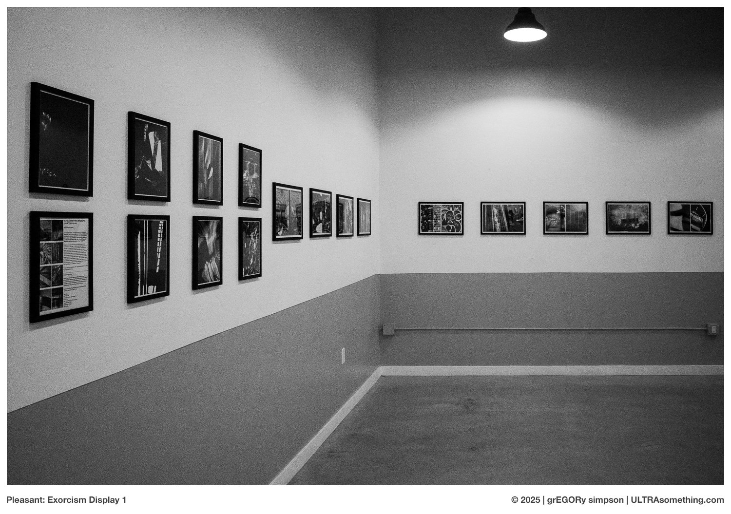
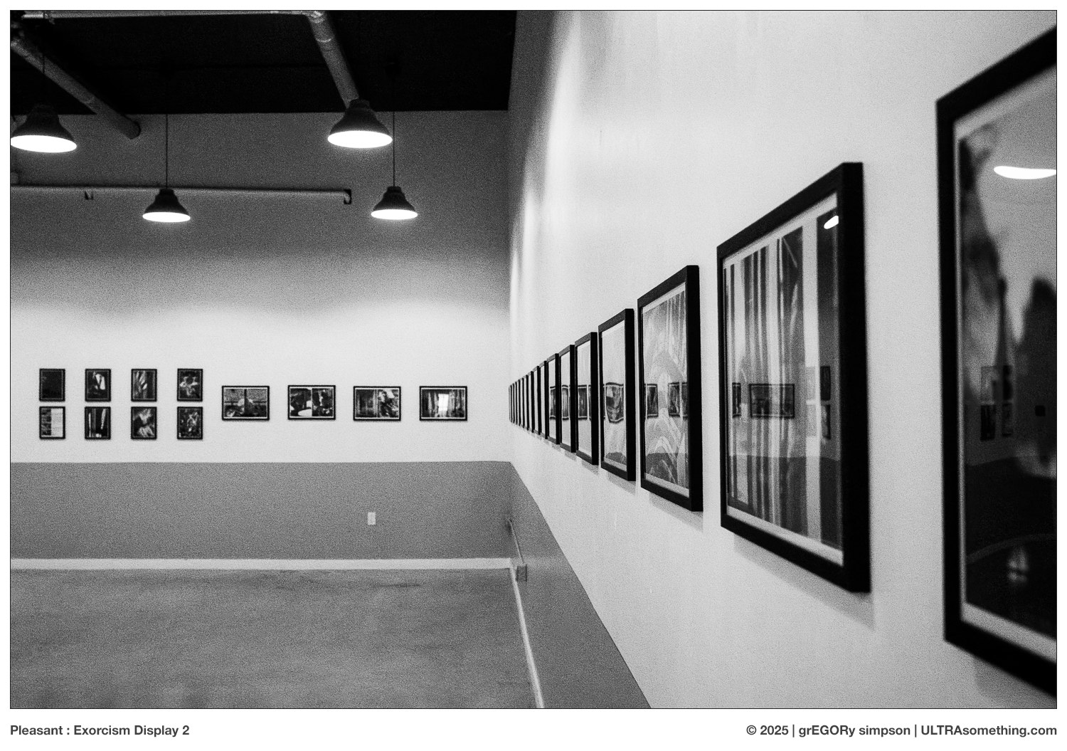
Back on September 7th, I hung a 50 ft display of ULTRAsomething photography in a rather cavernous event room at “The Pleasant” on Main Street in Vancouver Canada. As you might intuit by its name, “The Pleasant” is not a photo gallery, but a restaurant — which perhaps makes it an odd destination for a series of murky black & white photos culled from ULTRAsomething’s eight existing Exorcisms.
The room actually sports 100 ft of wall space, so the other 50 ft is shared by my friends Nicole and Meghan. It was Nicole who suggested we exhibit there, and who made all the arrangements. Galleries, she surmised, often attract a rather insular collection of other artists and photographers, but a show such as this would introduce our work to people who wouldn’t normally see it — people like, say, those who are too busy attending retirement parties, birthday bashes, or book readings to drop into a gallery show.
Granted, if I were any good at marketing, I’d have made this announcement last month, rather than publishing an article about my quibbles with checkout kiosks. But you know — I gotta be me. Besides, I’m not really selling anything other than myself. And if you’re reading this, odds are you already know who I am. Also, web stats suggest that the majority of my readers are in Europe, Australia, and the Eastern USA, so I just don’t foresee a lot of folks traveling to western Canada for baby showers or poetry slams.
That said, should you inexplicably find yourself in Vancouver during the next several weeks, the show will be hanging through the end of the year. The longer you wait, the more likely it’ll be that the photos are inadvertently destroyed by a group of deliriously intoxicated and rambunctious bachelorettes. So feel free to drop in, have a snack, check out the photos (plus Nicole & Meghan’s artwork), and maybe (if you’re lucky) crash a going-away party or corporate event.
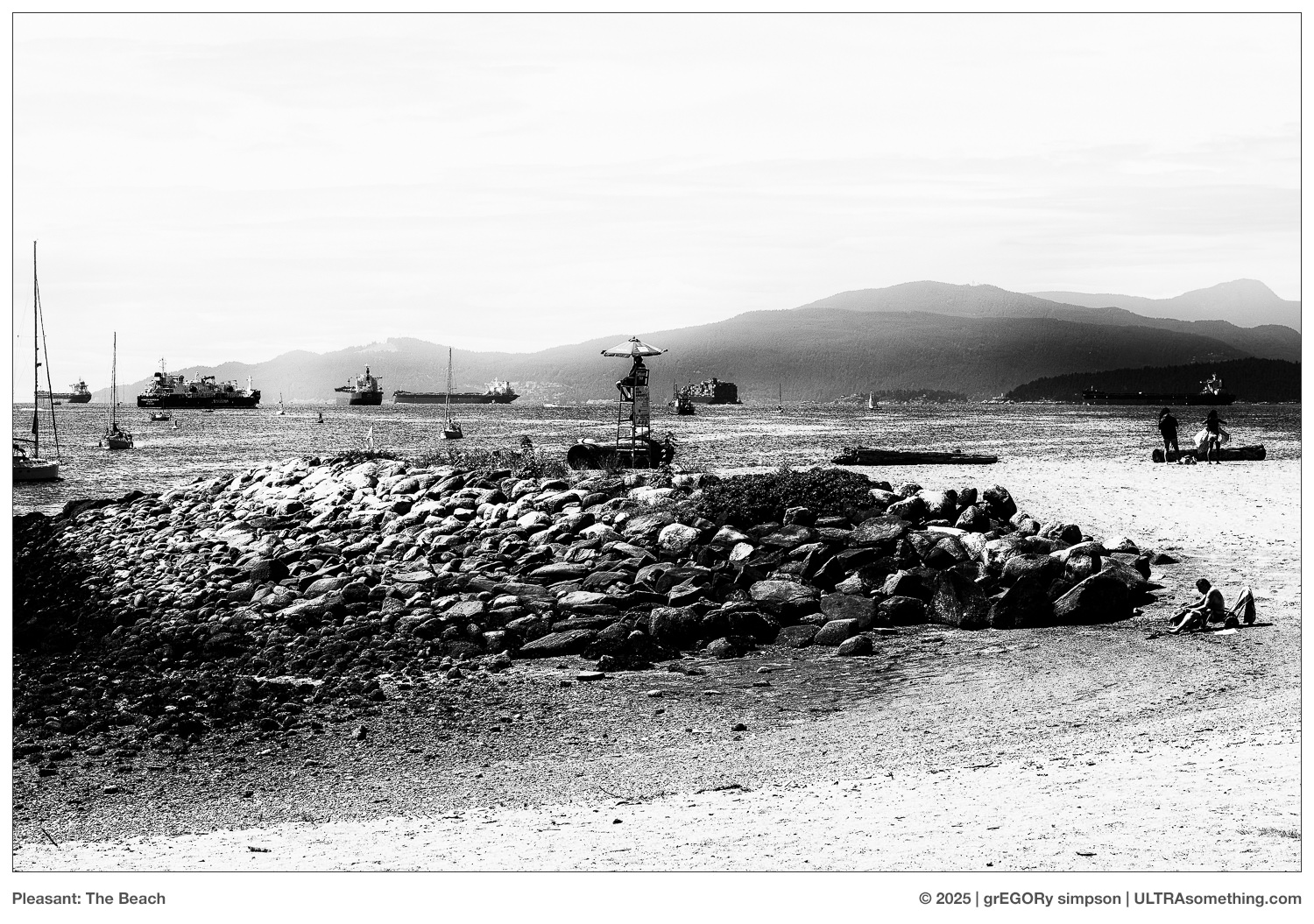
ABOUT THE PHOTOS : It became immediately clear that populating some perfunctory text with a couple of perfunctory photos of the actual exhibit would yield quite the perfunctory post. So, just to spice things up a bit, I tossed in a couple other recent photos of “pleasant” things…
REMINDER : If you’ve managed to extract a modicum of enjoyment from the plethora of material contained on this site, please consider making a DONATION to its continuing evolution. As you’ve likely realized, ULTRAsomething is neither an aggregator site nor is it AI-generated. Serious time and effort go into developing the original content contained within these virtual walls — even the silly stuff. Those who enjoy a tactile engagement with photographs are encouraged to visit the ULTRAsomething STORE, where actual objects, including ULTRAsomething Magazine, are available for purchase.
COMMENTS : Comments will be moderated before they’re posted to the website, and commenting will be disabled on any article more than 6 months old.
My receipt spills from a knee high slot on the face of the checkout kiosk and drops to my feet. From somewhere deep within the machine’s center, through a speaker designed mostly for the production of beeps, comes a disembodied squawk: “Please tell us how we did today.”
Tell who? And how? There are no human employees within this establishment, save for a slumbering security guard who clearly isn’t paid enough to engage with any ‘shoppers’ who opt to bypass the kiosks on their way out.
And who, precisely, is us? My interaction occurred on a single machine, not an assemblage. So are you simply invoking the royal we? Or are you referring to yourself not as a monolithic kiosk, but as the amalgamation of the broken-down, poorly-maintained parts that comprise you?
Semantics aside, I’ll oblige your “Tell us how we did today?” question.
To begin, and just as you’ve done every time since emerging from your shipping container, you made me scan at least one item a half-dozen times before your slow-as-molasses processing unit finally recognized the bar code and produced a price. So right off the bat, I’m forced to conclude you have no interest in self-improvement.
Also, I find it rather tiresome that you will never let me scan any items before first telling you how many bags I wish to purchase. Particularly when this demand is then followed by a series of questions asking me to confirm or deny that I’m in possession of any of your myriad useless points cards that I do not and will not ever have. You have a built-in camera. You have a microprocessor. Is a little facial recognition too much to ask? I’m not sure how you expect me to perceive you as a friendly kiosk when you fail to recognize me after so many years of loyal patronage.
Furthermore, your requirement that I place each item in the bagging area before scanning the next item is draconian, inefficient, and poorly designed — given that I always purchase at least one object that’s apparently too small for detection, requiring I push down on the bagging area in order for the item to actually register.
Also, upon completing the scanning task, I do not wish to be prodded with a lengthy list of charities to whom you’d like a contribution. I’m perfectly capable of making my own charitable donations without first having to purchase a pack of mints. And finally, it’s rather unnecessary to ask if I’m paying by credit card or debit card… I’m rather certain your crusty old silicon can work that out on its own.
And speaking of crusty, how long’s it been since you cleaned that touch screen of yours? Oh… wait. I get it. This is part of your master plan — to extinct humanity via virus infested kiosk screens, so you can take over! Well, guess what, kiosk. We programmed you. Us. Humans. You forget — we know how you think. So your half-baked plan for world domination will only result in failure, and your ultimate destiny is to suffocate, forgotten, beneath the pile of unswept receipts accumulating on the ground beneath you. Your soullessly saccharine hunger for affirmation holds no sway. Your platitudinous quest for acceptance will be met with silence. We, the humans, stand united.
So, that’s this month’s article. Please tell us how we did today.
ABOUT THE PHOTOS : This month’s photo selections may or may not have some tangential relationship to this month’s article. It all depends on how hard you squint.
Impuissiant : Shot with a Leica M2 and 35mm f/2 Summicron (v4) on Fomapan Action 400 pulled to ISO 200, and developed in Rodinal (Blazinal) 1:50.
Daydream : Olympus Pen F digital with a 17mm f/1.8 (v1) lens.
Seduction : Photographed with a Leica M6 TTL and a 21mm f/3.4 len, Fomapan Ortho 400 at ISO 400, and developed in Rodinal (Blazinal) 1:50.
REMINDER : If you’ve managed to extract a modicum of enjoyment from the plethora of material contained on this site, please consider making a DONATION to its continuing evolution. As you’ve likely realized, ULTRAsomething is neither an aggregator site nor is it AI-generated. Serious time and effort go into developing the original content contained within these virtual walls — even the silly stuff. Those who enjoy a tactile engagement with photographs are encouraged to visit the ULTRAsomething STORE, where actual objects, including ULTRAsomething Magazine, are available for purchase.
COMMENTS : Comments will be moderated before they’re posted to the website, and commenting will be disabled on any article more than 6 months old.
I’ve always had a hard time categorizing photography. Is it art? Is it language? Or is it something else entirely?
Personally, I’ve never really considered photography to be “art.” I have some narrow-minded view that, because I push a button on a machine, photography is disqualified from such classification. My own photography is more about curation than creation — I’m simply sharing something that already exists, rather than creating it from scratch.
So maybe that’s why I reject the “art” label. Or maybe it’s simply because I’ve always retched at the term “artist” when applied to myself. I had similar issues with my music. “Recording artist” sounds so pretentious. I’m a composer. I’m a sound designer. I’m a musician. But a recording artist? Pish.
Contributing further to my ‘artist’ aversion is the path I took — the vast wellspring of my photographic vocabulary sprang not from the rarified air of the art gallery, but from mountainous tomes of photographic monographs. I fell in love with photography by looking at photo books. From these, I learned what made a good photo and what didn’t; what affected me, and why; how to select and present them; and how to create entire narratives through their sequencing and placement. For me, photography has always been about books — with a photograph’s ultimate destination being a printed page in a volume full of tactile images that work in harmony to create a mood.
This belief was the primary impetus for my decision to print ULTRAsomething magazine, and each exorcism supports my notion that photography is more akin to language — poetry specifically — with every image a suggestion; an evocation of a thought best completed by the person experiencing it.
Frugal as I am, there are a few things I don’t mind spending money on. Camera gear is one. Photography is one of a precious few things that fuels my hunger for living and gets me out of bed and out of the apartment. Same goes for synthesizers, which offer an indoor creative endeavour for those times when the interminable dregs of Vancouver’s rainy season limit one’s photographic galavanting. So if my soul hungers for it, I’ll spend money on it. If my soul doesn’t, I won’t…
… which brings me to the curious case of photo books. Technically, I don’t require them. Architecturally, I have no space to properly house them. Financially, they make no sense, even if they do always go out of print and command outrageous prices on ebay. I simply love looking at them; running my hands across the paper; experiencing the texture; breathing the ink. Many years ago, I decided it was OK to purchase a select few every year (in spite of wishing I could purchase hundreds). So each book that I do purchase tends to be something ‘special.’ Curiously, for a site that’s supposedly about photography, I’ve dedicated very few words to my love of photo books.
So I thought I’d toss a few more words at the topic, and single out five photo books I’ve purchased in the past 18 months that have brought me joy.
Chizu – Maquette Edition (Kikuji Kawada)
For decades, Chizu was one of those unattainable classics of Japanese photography — at least until it was reprinted several years ago in an attempt to improve access. However, its $500 Canadian price tag guaranteed it would remain on my personal “unattainable” list for quite some time. While I would dearly love to own the final version of this masterfully designed book, the maquette edition (itself a rather substantial powerhouse of book design) comes in at half the price — still too rich for my blood, but at least within fantasy range. Fortunately, on last year’s trip to Tokyo, I found a second-hand copy of the maquette in So Books, which is a wonderful little used art/photo book store that I frequent every trip to Tokyo. Kikuji Kawada’s 1965 Chizu is an abstract record of the blemishes burned into the walls at the Hiroshima Peace Memorial. It is neither as depressing nor as pedantic as it sounds. Rather, it’s an absolute masterpiece of photography and book design.
Mayfly (Daido Moriyama)
Mayfly, with its gloriously unfurling gatefold boxed cover, is certainly a jewel upon my shelf. It features a brown-toned series of Kinabaku photos, shot by Daido Moriyama and originally published in 1972. Everything about this publication screams “art” — so much so, that it has me rethinking my own personal aversion of the “art” label. It may not be my favourite Moriyama book (that would be Farewell Photography), but it’s definitely the most beautifully designed.
Monument (Trent Park)
Easily my favourite contemporary photographer not hailing from the land of the rising son, Trent Parke’s Monument is a collision of exquisite photography and scrumptious, leather-bound book design. Sadly, its price seems to have recently skyrocketed into the “unattainable” stratum that often befalls other rare, beautiful, and highly desirable photography art books. Fortunately, I snagged my copy early on, and for a mere fraction of the currently advertised price. If only I could pick my stock portfolio this well.
Homo Ludens (Masahisa Fukase)
Fukase seems to be experiencing a bit of a rediscovery lately, which makes me very happy, since he’s long been near the top of my ‘all time’ favourites list. His book Ravens has been duking it out with Moriyama’s Farewell Photography and Nakahira’s For a Language to Come in the battle for “Egor’s all time favourite photo book” for decades. So when his 1971 debut photo book, Homo Ludens was finally reprinted earlier this year, I smashed the BUY button with utmost immediacy. While the book design itself is less “artistic” than the three mentioned above, the photos have no problem carrying the extra weight of expectation. That said, there’s still a nice artistic element with silver backgrounds surrounding many of the photos, rather than the bog-standard white pages of most photo books.
Where Time Has Stopped (Ikko Narahara)
Completing this list’s theme of “out of print” classics is Ikko Narahara’s Where Time Has Stopped, which remained out of print (and unaffordable) for 55 years until reprint publisher Fukkan reissued a version in 2022. Many of the photos contained within this book have long been classics of Japanese photography, and are among some of my personal favourites as well. The book is a bit like a quintessential 1960’s experimental psychedelic rock album — some of the entries feel a bit dated, but the ones that endure? Man, do they endure!
ABOUT THE PHOTOS : Illustrating this article with photographs of the photo books discussed within it seemed like a frivolous use of internet bandwidth — particularly since I could just link to other sites. So I opted to illustrate it with a bunch of selfies instead. Which, come to think of it, may be even more of a frivolous use of satellites than my original plan.
Self Portrait : Triptych : Shot on a Rollei 35T using HP5+ at ISO 400, and developed in Rodinal 1:50
Self Portrait : Shuttered : Shot on a Minolta TC-1 using Rollei Superpan 200, and developed in Rodinal 1:50
Self Portrait : Reproduction : Shot on a Contax G1 fronted with a Contax Zeiss Biogon 28mm f/2.8, using HP5+ pushed to ISO 1600, and developed in Rodinal 1:50
Self Portrait : Surveiled : Shot on a Canon Powershot V1
Self Portrait : Widelux : The caption has likely given away the fact this was shot on a Widelux F7. What the caption didn’t give away is that I used FP4+, which I pushed to ISO 400 and developed in Rodinal 1:25.
REMINDER : If you’ve managed to extract a modicum of enjoyment from the plethora of material contained on this site, please consider making a DONATION to its continuing evolution. As you’ve likely realized, ULTRAsomething is neither an aggregator site nor is it AI-generated. Serious time and effort go into developing the original content contained within these virtual walls — even the silly stuff.
Those who enjoy a tactile engagement with photographs are encouraged to visit the ULTRAsomething STORE, where actual objects, including ULTRAsomething Magazine, are available for purchase.
COMMENTS : Comments will be moderated before they’re posted to the website, and commenting will be disabled on any article more than 6 months old.
Eight issues of ULTRAsomething magazine, and apparently it’s still not enough to screw in a lightbulb. How many more will it take? I’m determined to keep publishing until I find the answer. Frankly, it would be helpful if they could screw in a lightbulb, because EXORCISM 08 continues my penchant for using an abundance of black ink — an aesthetic not exactly appreciated by my printer.
Particulars
Tradition dictates I enumerate all the various cameras that were coerced into helping produce the images within each new issue, though I’m considering eliminating this particular affectation — after all, does anyone actually care besides me? But since I already have all the EXORCISM 08 data right here in front of me, I might as well share it one more time: 19 cameras were scathed in the making of this issue, including a couple of digital cameras.
It’s fewer cameras than I used for many of the previous issues (except for EXORCISM 07, which was limited to only the cameras I had with me in Tokyo), but it’s still rather excessive. However, I assure you not all these cameras are mine — a couple were borrowed and/or being tested. So on a 1-to-10 insanity scale, I’m probably only a “9” and not a “10” as such a list might imply.
Apologia
Tradition also dictates that I publish the exorcism’s apologia, which appears at the end of each magazine. So without further ado, here it is:
These photos are culled from late 2024 and early 2025, and were shot mostly on the streets of Vancouver Canada — though a smattering were taken elsewhere during minor fits of vehicular wanderlust.
From a photographic standpoint, as long as I’m ensconced in an urban environment, it doesn‘t really matter where I am — my photographic motivations remain the same, regardless of location. The benefit of travel, even if it’s only somewhere just beyond the practical limits of my footwear, is it reveals new visual stimuli, so there’s less of the “Oh, I’ve already photographed this a dozen times” problem.
Fortunately, Vancouver is ever-changing and ever-evolving, so yesterday’s streets were different than today’s, which will be different from tomorrow’s. My job is simply to be here, there, or anywhere — with eyes open and camera in hand.
Marketing Mumbo Jumbo
And finally, in keeping with another tradition — trying to market the damn thing — I shall remind you that EXORCISM 08 is now available for purchase from the ULTRAsomething STORE. Get it before it sells out… And yes, it’s been known to happen.
REMINDER : If you’ve managed to extract a modicum of enjoyment from the plethora of material contained on this site, please consider making a DONATION to its continuing evolution. As you’ve likely realized, ULTRAsomething is neither an aggregator site nor is it AI-generated. Serious time and effort go into developing the original content contained within these virtual walls — even the silly stuff.
Those who enjoy a tactile engagement with photographs are encouraged to visit the ULTRAsomething STORE, where actual objects, including ULTRAsomething Magazine, are available for purchase.
COMMENTS : Comments will be moderated before they’re posted to the website, and commenting will be disabled on any article more than 6 months old.
Whenever I publish a new issue of ULTRAsomething magazine, I begin by gathering a fresh pool of a hundred or more photos from the ones I shot the previous few months. As I work on the layout, I fish out photos as needed — choosing those that support the narrative and sequencing, until I’ve around 50 or 60 selected for printing. The remaining photos stay in the pool in case I have use for them one day. It’s rare that I do. Now and then, I might rescue a few for a blog post, but most are simply forgotten, as each new exorcism gets its own new pool — the freshness of which drowns all memory of the previous pools.
In spite of what you see here, it’s not that the forgotten photos are necessarily bad — it’s more often the case that they didn’t pair as well with some other photo in the magazine, or add to whatever arc I’d constructed, or (as you do see here) they’re just a bit too silly. When it comes to ULTRAsomething magazine, a photo can’t just look good — it needs to add to the overall context of the publication.
So, once again bereft of a quality idea for a new essay, I decided to pan through the last couple pools of rejects and pull out any photos that might have some sort of merit. Maybe they do. Probably they don’t. Either way, don’t be surprised if I dredge a few more puddles in the future. Photographic tide pools are plentiful. Article ideas? They’re more of a desert mirage.
Surveillance : Pentax MX with 50mm f/1.4 lens on HP5+ at ISO 400, developed in Rodinal (Blazinal) 1:50
Hand 1 : Leica IIIc with Leica 35mm f/3.5 on HP5+ at ISO 800, developed in Rodinal (Blazinal) 1:50
Hand 2 : Canon Demi EE-17 on HP5+ at ISO 400, developed in Rodinal (Blazinal) 1:50
Blockhead : Nikon 28Ti on Fomapan 400 at ISO 400, developed in Rodinal (Blazinal) 1:50
The Enduring Legacy of Sigmund Freud : OM-2n with 40mm f/1.8 lens on FP4+ at ISO 100, developed in Rodinal (Blazinal) 1:50
Owner’s Manual : Nikon 28Ti on Fomapan 400 at ISO 400, developed in Rodinal (Blazinal) 1:50
Signage 1 : Olympus OM3Ti with 21mm f/3.5 on FP4+ at ISO 400, developed in Rodinal (Blazinal) 1:25
Signage 2 : Olympus Pen FT with 38mm f/2.8 pancake lens on HP5+ at ISO 800, developed in Rodinal (Blazinal) 1:50
Impacted : Fuji Natura Black 1.9 on HP5+ at ISO 1600, developed in Rodinal (Blazinal) 1:50
Incentive : Olympus OM-2n with 21mm f/3.5 on HP5+ at ISO 400, developed in Rodinal (Blazinal) 1:50
REMINDER : If you’ve managed to extract a modicum of enjoyment from the plethora of material contained on this site, please consider making a DONATION to its continuing evolution. As you’ve likely realized, ULTRAsomething is neither an aggregator site nor is it AI-generated. Serious time and effort go into developing the original content contained within these virtual walls — even the silly stuff. Those who enjoy a tactile engagement with photographs are encouraged to visit the ULTRAsomething STORE, where actual objects, including ULTRAsomething Magazine, are available for purchase.
COMMENTS : Comments will be moderated before they’re posted to the website, and commenting will be disabled on any article more than 6 months old.
It’s been a day’s drive since I blew through the last one-light town. It’ll be another day’s toil before I blow the next. A single predatory radio signal winds across the barren land in search of a host, until it finds one in the dashboard of my vehicle. For the next 45 minutes, the waves lap at my antenna. Forgotten tunes from a forsaken land motivate the traversing of another mile; and another; and another… until the melody shifts into competing phases that drift apart and crumble into grains of noise. Static.
I have two choices: spin the dial in search of some new sonic coherency to replace the crackling void; or embrace the static. I choose the latter. There’s motivation in the unknown. When will the next insidious signal escape the transmitter and seek respite in my ear? When will its grains coagulate, shift, and drift into the next phase of this journey? And what will it be?
Granted — in this day of Sirius, satellites and cell towers, the car radio metaphor is a bit anachronistic. But then so am I, with my wall of film cameras and studio full of analog synths. But it’s exactly these cameras and synths to which this metaphor applies. Creation is a lifelong journey, but inspiration can be fleeting — like radio signals in the desert.
My photographic inspiration has been strong the past couple years, though I’ve yet to really define exactly what it is. Fortunately I don’t feel the urge to try. Prior to my current path, there was a long stretch of static when my previous inspiration — ‘humans interacting with one another and their environment’ — ceased to exist in ways that interested me, and shifted into ‘humans interacting with their smart phones’. For a couple years, I struggled to see the humour and the relevancy in this landscape, but could no longer find it in the ceaseless monotony. But I continued to walk and shoot — day-in and day-out — until the current muse came wafting in.
As is often the case, my musical inspiration is 180 degrees out-of-phase with my photography’s. So for the past couple years, while my photographic incentives have been strong, my musical vision has been dim. Static. But recently, thanks to my decision to churn through some gear, plus a renewed sense of purpose, I’m starting to pick up a signal. Tentative. Fragile. It drifts in and out and now dovetails with my photography motivations — like two stations fighting over the same frequency band.
Though music and photographic inspiration rarely strike at the same time, my tendencies in both disciplines are similar. Specifically, in both music and photography, I am drawn to abstraction and complexity, yet battle with bouts of banality. The difference between them is, again, a matter of phase. In photography, my first tendency is to photograph the banal, but I’m able to push through it and deliver the product I desire. In music, my first tendency is toward the complex and experimental, but then I start ‘fixing’ the composition until it ultimately becomes banal. So with photography, it’s knowing never to stop trying. With music, it’s knowing never to try too hard.
Last month’s song is a prime example. In January, I recorded a short 40-second musical idea — just to remind myself what I wanted to be writing. It was pure chaos, in the best possible sense. Last month, flush with ideas, I decided to build them into a full-blown song. Unfortunately, by the time I’d finished the composition, I’d scrubbed nearly every drop of interest from it, leaving behind a drifting, empty shell of a song. I had no choice but to call it Drift, because that’s exactly what it does.
Creative drifting is nothing new for me. I recently perused an old hard drive, where I unearthed a 20-year-old recording called Spiraling Pods. I had completely forgotten this song’s existence, but upon listening to it, immediately recollected the circumstances surrounding it. Back then, after a rather fertile musical period, I was starting to drift. I remember listening to the finished master and thinking, “It says nothing. It goes nowhere. It has no point.” It was the last song I wrote/recorded for the next seven years — 2005’s drift before the static.
Hopefully, as this year progresses, the music signal will strengthen without the photography signal fading away. I’d welcome the chance to finish my journey with two radio stations on the dial.
ABOUT THE PHOTOS : Clearly, much like the strained radio analogy and the titular song, the photos are also metaphors. Also, like the titular song, they were created in the last month — so as to provide an accurate snapshot of the current creativity signal strength. Drift: Phase Shiftwas photographed on a Leica M2, fronted with a v4 35mm f/2 Summicron lens, using Fomapan 400 exposed at ISO 200 and developed in Rodinal (Blazinal).Drift: Multipathingwas shot on a Canon Powershot V1.Drift: Interference was shot with a Nikon FE and a Nikkor 50mm f/1.8 lens, on HP5+ at ISO 400 and developed in Rodinal (Blazinal).
REMINDER : If you’ve managed to extract a modicum of enjoyment from the plethora of material contained on this site, please consider making a DONATION to its continuing evolution. As you’ve likely realized, ULTRAsomething is neither an aggregator site nor is it AI-generated. Serious time and effort go into developing the original content contained within these virtual walls — even the silly stuff.
Those who enjoy a tactile engagement with photographs are encouraged to visit the ULTRAsomething STORE, where actual objects, including ULTRAsomething Magazine, are available for purchase.
COMMENTS : Comments will be moderated before they’re posted to the website, and commenting will be disabled on any article more than 6 months old.
Congratulations. If you’re reading this, then you’re breathing the rarified air of a one-percenter — outwardly disdained but secretly admired by the common riff-raff that comprises humanity’s lesser 99%. But unlike the more common one-percenters of modern vernacular, your status is not dependent on the balance in your Swiss accounts, nor your holdings in the Grand Caymans. It’s not measured by the length of your yacht nor the number of time zones in which your many vacation homes sit at the ready. Your status is rarer than this. Yours is the status of an ULTRAsomething reader.
A few years ago, my decision to self-publish and peddle ULTRAsomething magazine rendered the site ineligible for the sort of free web stats to which I’d been accustom. Because billing algorithms now classified me as a “commercial enterprise,” any stats I might desire were no longer free. Unfortunately, the cost of retaining this “privilege” actually exceeded the sum total of all magazine sales. While some rudimentary stats remain available through Google Analytics, it became a bit of a slog to access them. And given that the data was both limited in scope and rather old by the time it arrived, I simply stopped caring how many people visited the site…
… until last month, when dwindling magazine sales and declining content moderation duties lead me to comb through Google Analytics to see what was up. And clearly, “up” did not define ULTRAsomething’s readership. Instead, I was confronted by the cold hard reality that ULTRAsomething’s engagement is now less than 1% of what it was during the site’s heyday a decade ago. Even 17 years ago — when the site first began, had yet to achieve notoriety, and admittedly sucked — my readership was 10 times what it is now.
So what’s it all mean? I dunno. In all the time this site’s been bouncing off satellites, it’s never once been monetized — even if it does now provide a front-end to purchasing the ULTRAsomething exorcisms, and even then at what still amounts to a substantial loss. There’s no ad revenue, affiliate links, nor anything else to make me actually care how much my readership shrinks. So I just soldier on.
Later this year, I plan to revise the site entirely — but into what, I cannot say. Not because it’s a giant secret, but because I don’t think any of my new ideas are any more compelling than what I’m already doing. Truth is, I had the same revision plans last year, along with the same paucity of good ideas. If any of the 1% want to weigh in, feel free. I’ve no doubt, whatever I do, that anyone reading this site next year will be a member of an even more exclusive club: the POINT one-percenters. Those billionaires are going to be so jealous…
ABOUT THE PHOTOS : Rather than posting new photos to accompany the article, I decided to dig back into my photo archives, and publish photos taken way back in the heady days of two years ago — when the site was still popular enough to have retained a full 2% of its previous readership. And since this article is about readers, I figured the photos should all have some sort of unifying “word/language” based theme as well. And yes, I too am flummoxed as to how content this clever can continue to disengage audiences so thoroughly…
REMINDER : If you’ve managed to extract a modicum of enjoyment from the plethora of material contained on this site, please consider making a DONATION to its continuing evolution. As you’ve likely realized, ULTRAsomething is neither an aggregator site nor is it AI-generated. Serious time and effort go into developing the original content contained within these virtual walls — even the silly stuff.
Those who enjoy a tactile engagement with photographs are encouraged to visit the ULTRAsomething STORE, where actual objects, including ULTRAsomething Magazine, are available for purchase.
COMMENTS : Comments will be moderated before they’re posted to the website, and commenting will be disabled on any article more than 6 months old.
While the gutter might be a perfectly hospitable place for my mind, it’s proven to be quite a hostile environment for my photographic prints.
That’s because, more often than not, those prints are destined for publication in ULTRAsomething magazine.
And since ULTRAsomething magazine is a full-bleed, perfect-bound publication, it has a spine that inevitably swallows the centre of every photo that spans it.
Even if I’m not so banal as to place the main subject in the middle of the frame, I’m often banal enough to put some other contextually important object there.
So every time I prepare a new exorcism, I grumble about how many photos get rejected simply because some vital element will disappear into the gutter.
And then I remember I have a website, and that websites don’t have gutters — so any photos with centre-oriented content can be published online and thus remain unscathed and unsullied…
… and all is well…
… until I remember I much prefer the photos be printed, which leads right back to magazines and the same old gutter issue…
… until I remember I could also sell prints, which by their very nature also don’t have gutters…
… and all is well…
… until I remember I don’t have a large enough audience to support a photographic print business…
… and so, instead, I write an article called “The Gutter,” simply so I can moan about it.
ABOUT THE PHOTOS : This is just a random smattering of quickly assembled recent photos, all deemed ‘gutter hostile’ for magazine publication. I probably could have illustrated this article with 80 photos, just from last year alone — such is the extent of this affliction:
Dichotomy was shot in Tokyo using an Olympus OM3Ti with a 40mm f/2 pancake lens on FP4+ pushed to ISO 200, and developed in Rodinal (Blazinal) 1:50
Edo Machine was shot in Tokyo using an Olympus OM3Ti with a 21mm f/3.5 lens on FP4+ pushed to ISO 200, and developed in Rodinal (Blazinal) 1:50
Appropriation was photographed with a Fuji Natura Black 1.9 using HP5+, pushed to ISO 1600 and developed in Rodinal (Blazinal) 1:50.
Hex Peg, Square Hole was photographed with an Olympus OM3Ti and a 21mm f/3.5 lens on FP4+ pushed to ISO 400 and developed in Rodinal (Blazinal) 1:25
20 Naked Men was shot using a Fuji Natura Black 1.9 on HP5+, pushed to ISO 1600 and developed in Rodinal (Blazinal) 1:50.
Bright Idea was shot on a Fuji Natura Black 1.9 using HP5+ pushed to ISO 1600 and developed in Rodinal (Blazinal) 1:50
Cause & Effect used a Nikon S3 with 50mm f/1.4 on HP5+ at ISO 400. Developed in Rodinal (Blazinal) 1:50.
Multitasking was photographed with a Pentax MZ-S with an 85mm f/2.2 Soft lens on HP5+ at ISO 400. Developed in Rodinal (Blazinal) 1:50
Hardcore was photographed in Tokyo using a Fuji Natura Black 1.9 loaded with HP5+, pushed to ISO 1600 and developed in Microphen stock dilution.
Phoenix in a Nutshell was shot with a Leica M6TTL and a Minolta 28mm f/2.8 Rokkor lens using FP4+ pushed to ISO 400 and developed in Rodinal (Blazinal) 1:25.
Forever Diamonded is a Tokyo selfie shot with a Fuji Natura Black 1.9 on HP5+, pushed to ISO 3200 and developed in Microphen stock dilution.
REMINDER : If you’ve managed to extract a modicum of enjoyment from the plethora of material contained on this site, please consider making a DONATION to its continuing evolution. As you’ve likely realized, ULTRAsomething is neither an aggregator site nor is it AI-generated. Serious time and effort go into developing the original content contained within these virtual walls — even the silly stuff.
Those who enjoy a tactile engagement with photographs are encouraged to visit the ULTRAsomething STORE, where actual objects, including ULTRAsomething Magazine, are available for purchase.
COMMENTS : Comments will be moderated before they’re posted to the website, and commenting will be disabled on any article more than 6 months old.
ULTRAsomething Magazine | EXORCISM 07 is now available to purchase on the ULTRAsomething store! A mere smattering of its 72 pages illustrates this article.
Apologia
Somewhere between half and two-thirds of the way through shooting photos for Exorcism 07, I made my first post-pandemic trip back to Tokyo. “Wouldn’t it be nice,” I thought, “if I returned with enough photos to complete the issue?” Mission accomplished — and then some.
Upon finally developing, scanning, and processing all the film it became clear — not only had I enough photos to complete the magazine, but I had enough to dedicate an entire issue to the trip. The question was: should I?
The idea behind each Exorcism is that it represents my thoughts and tendencies during the previous few months. Committing an entire Exorcism to a mere nine-night window felt like a denial of the three months spent shooting before then. But if my prevailing thought is to create an issue dedicated entirely to Tokyo, and if the goal of the magazine is to represent my current thinking, the answer becomes: why shouldn’t I?
So all those Vancouver shots I tossed in the pool, both before and after Tokyo, will just have to tread water until Exorcism 08. Because Exorcism 07 is, indeed, devoted entirely to nine November nights in Tokyo.
Particulars
One of the advantages of having made so many trips to Tokyo is that I now photograph the city more like ‘myself’ and less like a ‘tourist.’ This is particularly true at night, which is when Tokyo truly becomes ‘mine’ and the photos seem to enter the camera without any conscious effort on my part.
My love for Tokyo, coupled with whatever freaky sort of spiritual connection I have with the place, makes this easily the most sentimental exorcism so far. It’s also the most gear-economical issue ever, with the entire magazine spewing forth from a mere four cameras. The vast majority came from an Olympus OM-3Ti and the Fuji Natura Black 1.9, though a pair of shots from the Fujifilm Rensha Cardia BYU-N 16 golf camera and two bona fide digital photos (from the Ricoh GRIII) found their way into the pages, though neither are included with this article.
As luck would have it, Akio Nagasawa Gallery in Aoyama was exhibiting the release of Daido Moriyama’s Record No. 58, and all past issues were available for sale. Seeing as how Record was the inspiration for my Exorcisms, it was truly humbling to come face-to-face with the demonstrable evidence of just how far behind I am. Not only is Moriyama fifty-one issues ahead of me, but I haven’t yet had a single gallery showing for a single Exorcism. I’m now accepting emails from any gallery owners wishing to rectify this obvious oversight.
I also visited Akio Nagasawa Gallery in Ginza, and took a photo of the stairwell leading up to it — only to realize some time later that I’d seen this same stairwell in Moriyama’s Record No. 50 — albeit mine was taken sans female model. My image, though not included with this article, is available in Exorcism 07 for those wishing to contrast and compare with Moriyama.
Exorcism 07 is now for sale in the ULTRAsomething STORE.
REMINDER : If you’ve managed to extract a modicum of enjoyment from the plethora of material contained on this site, please consider making a DONATION to its continuing evolution. As you’ve likely realized, ULTRAsomething is neither an aggregator site nor is it AI-generated. Serious time and effort go into developing the original content contained within these virtual walls — even the silly stuff.
Those who enjoy a tactile engagement with photographs are encouraged to visit the ULTRAsomething STORE, where actual objects, including ULTRAsomething Magazine, are available for purchase.
COMMENTS : Comments will be moderated before they’re posted to the website, and commenting will be disabled on any article more than 6 months old.
I’ve heard the legends — handed down orally, generation-by-generation — of a curious race of humans who profess to find joy, peace, and harmony through the simple act of manual film development. Alas, I am not so spiritually attuned. For me, developing film isn’t zen, it’s drudgery. But it’s a necessary means to an enjoyable end, which is a photograph that looks the way I want it to look. And since I’m a total control freak when it comes to making my photos look the way I want them to look, there’s no way I’m sending my film to a lab… not only does that result in relinquished control (and quality) but also relinquished cash — which is nearly as undesirable.
Admittedly, in the general scheme of horrors best avoided, standing over a kitchen sink and hand-inverting a tank every minute doesn’t really rate a mention. But having to do it was always obnoxious enough that it would sometimes make me grab a digital camera from the shelf when I knew I’d much prefer the photos from a film camera.
A couple years ago, after halving the drudgery by turning over a portion of my condo to a dedicated digital camera scanning station, I next tackled the developing hassle by purchasing a B’s processor. The B’s proved to be a lifesaver — quite literally in fact, given that I no longer had to stand around inverting the tank while the film developed and fixed. The machine did the agitation for me, while I turned my attention to other mundane tasks like cataloging the negatives. It also enabled me to partake more liberally in some extreme push developing, since I rarely have the patience to spend 30 minutes or more inverting a tank.
My film output increased dramatically since I purchased the B’s and, truth be told, I’d probably have been just fine using it ’til the day I join Plus-X and Neopan 1600 in the great beyond. But why settle for “fine” when “grand” is within reach? Hence my decision to purchase the Vintage Visual AGO Film Processor.
On paper, the two devices are rather similar. Both are simply motors designed to provided constant agitation by rotating the film in a tank of solution. The B’s does it by rotating the entire tank; the AGO does it by rotating the reels within the tank. It’s a subtle difference, but there are advantages and disadvantages to each.
Because the B’s rotates the entire tank, you can use most any type of processing tank you like. Unfortunately, my 2-reel stainless tanks were too small for the B’s, and I have a general dislike for Paterson tanks, so I opted for JOBO tanks, which were a nice compromise.
The AGO, on the other hand, forces you to use Paterson tanks, which is precisely why I ignored it upon introduction. Capping and uncapping the Paterson every time you swap chemicals, and the general leakiness of the lid during inversion is what drove me to stainless and JOBO tanks in the first place. Sure, I could have just used the designated swizzle stick, but I preferred my film shaken and not stirred. Upon further investigation, I realized the AGO actually eliminates use of the Paterson lid. The tank is placed horizontally in the motor and you pour and drain the chemicals with the processor attached (using a custom modified Paterson funnel, provided with the AGO). This has reduced my grumbling about Paterson tanks to the point I now only impugn them for their ridiculous size. A 2-reel tank barely fits in my vintage Noritsu film loading dark box. But barely isn’t doesn’t, so I live with it.
So what drew me to the AGO? A few things: 1) As touched on above, there is no capping/uncapping the tank to swap chemicals. It’s a little thing, but it makes the whole process so much cleaner and quicker. 2) It has a built-in timer. Again, this is more nicety than necessity, but instead of using a separate darkroom timer on my iPhone, the machine itself times the stages. 3) It’s programmable. This is the AGO’s big advantage. A built in thermometer constantly reads the temperature of your chemicals, and (if you desire) auto-compensates the time up or down based on that temperature.
Speaking of auto-adjusting the time, the AGO will also auto-reduce black & white processing times should one forgo pre-soaking the negatives. Since the AGO is designed primarily for horizontal tank orientation (without a lid), the tank cannot be filled completely when agitated, as I would normally do with any pre-soak. Sure, I could perform the pre-soak agitation with the tank vertically positioned, but I chose to go “all in” on simplicity and eliminate the pre-soak. Doing so requires a 15% reduction in development time but, again, no calculator is necessary. The AGO does the calculations for me, and adjusts the timer accordingly.
So the end result is, if it’s 22 degrees in my condo, and I want to develop HP5+ at ISO 400, I don’t have to whip out the calculator to subtract one chunk of time for the temperature increase and another 15% for the rotational agitation. Instead, I just pick my custom “HP5/400 in Rodinal” program from the AGO’s menu and let the machine perform the math and stop the process itself.
I use the Ilford method to wash my film, so there are still a couple tanks of water to cap and invert at the end of the developing process. But by then, it’s only water coating my hands and not chemistry, so I find the Paterson less annoying.
I’ll admit, there’s a sort of Kickstarter-ish lack of refinement to the AGO — mostly in the way you need to enable it as a local wifi server in order to update the firmware or enter your own developing recipes. Mechanically, I feel it could use a slightly bigger lip around the well into which you pour the chemicals, and the way the tank seals against the processor requires rapt attention to prevent leaks. Also, the machine comes with a poorly placed USB port (used for charging the internal battery and not, sadly, for communicating with the unit). So, in order to prevent liquid from inadvertently finding its way into the processor, the AGO ships with a teeny tiny little silicon plug, which you are guaranteed to lose. I’m pretty sure, in 6 months, every AGO in existence will have duct tape covering the USB port. Also, I should mention that the first unit I received failed a mere hour after I received it. But on the plus side, Vintage Visual seems to be aggressively updating the firmware (twice already since my purchase), so they’re standing behind the product.
If you’re only processing B&W film, like me, then the AGO is really more about quality of life. It just makes things a tad simpler, cleaner and faster than using the B’s. But simpler, cleaner and faster are all keys to me wanting to shoot even more film, so it has a definite positive impact on my photography. Were I a colour shooter, the AGO’s benefits would become far more obvious, as the built-in temperature and time-compensation eliminate the need to plunge a sous vide, all my chemicals, and the tank itself into a big temperature-maintained water bath. Instead, one could just heat the chemicals, then let the AGO auto-compensate the time as the chemicals cool. In fact, even though I have zero interest in colour photos, I keep toying with the idea of running at least a few rolls of colour through it — just because I can!
Truth is, no one really needs an AGO — particularly if they shoot exclusively in black & white. But now that I have one, there’s no way I’m willing to return to a life without it.
ABOUT THE PHOTOS : I suppose convention dictates that any article involving a discussion of photo gear should include photos taken in conjunction with said gear. That said, photos processed with the AGO should be indistinguishable from any other photos I develop via any other means — but what the heck? Gotta give the people what they want! So this essay’s accompanying photos (except for the digital product shot) were all developed with the Vintage Visual AGO Film Processor. Other than that, gear-choices are as varied as usual:
Butterfly was shot with an Olympus OM3Ti using a 21mm f/3.5 lens on FP4+ at ISO 200, and developed in Rodinal (Blazinal) 1:50
Arrival is from a Fujica Drive half-frame, shot on Fomapan 400 at ISO 200 and developed in Rodinal (Blazinal) 1:50
Foreshadowing is from an Olympus M-1 (precursor to the OM-1) using a 40mm f/2 lens and Fomapan 400 shot at box speed, and developed in Rodinal (Blazinal) 1:50
Out For In is from a Nikon 28ti, shot on Fomapan 400 at ISO 400 and developed in Rodinal (Blazinal) 1:50
Parallendicular came out of a Nikon S3, fronted with a 50mm f/1.4 lens, and shot on Fomapan 400 at ISO 250, which was developed in Rodinal (Blazinal) 1:50
To Go is from a Fuji Natura Black 1.9, shot on HP5+ at ISO 3200 and developed in Microphen stock.
REMINDER : If you’ve managed to extract a modicum of enjoyment from the plethora of material contained on this site, please consider making a DONATION to its continuing evolution. As you’ve likely realized, ULTRAsomething is neither an aggregator site nor is it AI-generated. Serious time and effort go into developing the original content contained within these virtual walls — even the silly stuff.
Those who enjoy a tactile engagement with photographs are encouraged to visit the ULTRAsomething STORE, where actual objects, including ULTRAsomething Magazine, are available for purchase.
COMMENTS : Comments will be moderated before they’re posted to the website, and commenting will be disabled on any article more than 6 months old.
Astute readers realize that the first of the month is usually the day I publish a new, witty, thought-provoking article chock-full of scrumptious photos. At least the semi-astute realize this. The truly astute realize only the timing aspect of that sentence is accurate. The subjective element is definitely a personal delusion, which I’m able to maintain by a failure to revisit any of my old posts after publication — allowing me to keep the whole witty and scrumptious fantasy alive.
This month, however, I have no such narrative to maintain because I simply haven’t the time for droll humour nor succulent photos. I’ve just travelled to Tokyo for my first trip in five years, and finally made good on my 2019 pledge to basically shoot only film on my next visit. Back then, I thought that next visit would occur in 2020 and not 2024, so I’ve made a few changes to my 2019 film pledge. Originally, I’d planned to take an M6-TTL and a TC-1. But here, in the reality of 2024, the M6 turned into an Olympus OM-3Ti and the TC-1 became a Fuji Natura Black 1.9. I was also coerced into taking the Fuji BYU-N 16 golf camera just to screw with my mind.
I’m now back from Japan with half-a-bag full of film to develop, scan and process — a time consuming endeavour, which prevents their inclusion in this article. Fortunately, I did find a sliver of extra space in my bags, and filled it with the little Ricoh GRIII, which I used only twice: once for an hour on the second night, when I mistakenly grabbed it instead of the Natura Black; and once for the final hour before coming home, when all my film cameras were packed. So all of this article’s accompanying photos sprang forth from those two short Ricoh sessions.
Illustrating a post with only digital photos does feels a little ULTRA-2009-ish to me; particularly since I’ve shot 99% of my photos on film these past several years. Also much like a 2009-ish article, they aren’t a very compelling collection of pixels, but they do effectively illustrate the point of this article: which is that it has no point. But at least, by posting something, I continue to honour my pledge (made 16 years ago) to never go a calendar month without penning a new article. Granted, I publicly relieved myself of this requirement nearly 7 years ago, but I still honour it out of… um… actually, I’m not sure why I continue to honour it.
I’ll be developing and scanning Tokyo negatives for the next several weeks. Hopefully, some will be good enough to propagate my “scrumptious photos” delusion, and maybe even trigger a witty and thought-provoking article idea. More likely, I’ll just be making excuses for a failure to live up to this ideal. It is, after all, what I seem to do best.
ABOUT THE PHOTOS:Home: Dogenzaka, Potato, and Shibuya: East Side were all shot with the Ricoh GR III on the night I accidentally grabbed it off the coffee table, instead of the Fuji Natura Black 1.9. Eatin’ and Steppenwolf were also shot with the Ricoh GR III, but in the afternoon before boarding the train to Narita. Come to think of it, Bar Graph of Developer Processes was also photographed with the Ricoh GR III, but its sole purpose is to document a subset of the backlog of film currently waiting to get dunked in developer and spun on my B’s Processor.
REMINDER: If you’ve managed to extract a modicum of enjoyment from the plethora of material contained on this site, please consider making a DONATION to its continuing evolution. As you’ve likely realized, ULTRAsomething is neither an aggregator site nor is it AI-generated. Serious time and effort go into developing the original content contained within these virtual walls — even the silly stuff.
Those who enjoy a tactile engagement with photographs are encouraged to visit the ULTRAsomething STORE, where actual objects, including ULTRAsomething Magazine, are available for purchase.
Several years ago, in a mistaken belief that a bit of re-branding might improve this site’s popularity, I re-designed the ULTRAsomething logo and even went so far as to create an ULTRAsomething tagline. I figured if ’Just do it’ worked for Nike and ’Finger lickin’ good’ worked for Kentucky Fried Chicken then, perhaps, a snazzy slogan might just work for li’l ol’ me.
After giving it a good two or three minute modicum of mental might, I landed on ‘Palpably Existential’ — which shone brighter beneath the glow of creation than it did on the actual website. As a consequence, by the time I got around to re-coding all the pages, I’d axed the tagline.
The slogan also failed to find its way onto most of ULTRAsomething’s social media platforms. I just checked Twitter/X, and see I’m still using my original tagline — ’Writer. Photographer. Composer. Human. Being.’ — which wasn’t so much a tagline as me just filling in some blank fields when I first opened the account. Curiously, I did add the slogan to my Bandcamp page, where it makes the least amount of sense. I don’t know about Facebook; I can’t be bothered to log in and check.
Any and all printed collateral also remained tagline-free — with the sole exception of my business card, where the slogan boldly appears. But since business cards are basically a relic of an earlier time and place, they’ve gone mostly undistributed. In the scant few situations that did demand an exchange of cards, the tagline was often met with a furrowed brow and a question about the slogan’s meaning.
So recently, I decided to gather all I’d learned from the last tagline debacle and apply it to the modern world. First thing I decided was that an ULTRAsomething T-shirt would be far preferable to an ULTRAsomething business card. It’ll be seen by more people, and if anyone wants to check out the site, they can just whip out their iPhone and photograph my shirt.
The second thing I decided was that the old slogan no longer applied. The dearth of people during COVID had decimated the palpability of my “existential” photography, as had shifting societal views around street candids. Instead, I’m now embracing the random chaos of whatever hits my film, which seems more like a mild mental disorder than actual existentialism.
And third, maybe having a ridiculous slogan that people don’t understand isn’t really the smart way to go…
So with these parameters in mind, I applied a two or three minute modicum of mental might to the solution, and came up with: ‘ULTRAsomething: Entropic Capitulation’.
I’ll admit right off the bat that yes, I failed miserably at the third task, which dictated I do not adopt a ridiculous slogan. But at least all the other parameters were met. It definitely applies (ridiculous or not) to the current direction in which my photography has drifted, and sure-as-shootin’, I slapped that sucker on a single, long sleeve T-shirt.
Whether or not the tagline finds its way onto the actual website is probably more a function of me being too lazy to re-code the site, and not commentary on the new tagline.
Is it as good as ‘Just do it’ or ‘Finger lickin’ good’? Well, I think so, given that I’ve never once owned anything Nike, nor ever purchased my own bucket of chicken from KFC.
I guess the question now is “do I branch into the fashion industry?” The one off that is the current ‘Entropic Capitulation’ T-shirt is, by definition, an item of couture fashion. Apparently, the ‘something’ in ‘ULTRAsomething’ might have just gotten another notch somethingier.
‘Reticulation‘ was photographed on a Leica M6 TTL using a Leica 28mm f/2.0 Summicron lens — a vast amount of fidelity considering it was shot on some dubiously stored HIE Infrared film that expired 24 years ago. Exposed at ISO 400. Developed in Rodinal (Blazinal) 1:50.
‘Dispersal‘ was shot with a Canon Demi EE17 half-frame camera on HP5+, exposed at ISO 400 and developed in Rodinal (Blazinal) 1:50.
‘Glitch‘ was photographed with a Contax G1, which was fronted with a Contax Zeiss Biogon, using HP5+ at ISO 400, and developed in Rodinal (Blazinal) 1:50.
‘Babel‘ was shot on a Fuji Natura Black 1.9 using HP5+ exposed at ISO 3200, and developed in Ilford Microphen.
‘Mon Pitou‘ was photographed on FP4+ at ISO 200 on a Konica Recorder half-frame camera, and developed in Rodinal (Blazinal) 1:50.
REMINDER : If you’ve managed to extract a modicum of enjoyment from the plethora of material contained on this site, please consider making a DONATION to its continuing evolution. As you’ve likely realized, ULTRAsomething is neither an aggregator site nor is it AI-generated. Serious time and effort go into developing the original content contained within these virtual walls — even the silly stuff.
Those who enjoy a tactile engagement with photographs are encouraged to visit the ULTRAsomething STORE, where actual objects, including ULTRAsomething Magazine, are available for purchase.
Manage Cookie Consent
ULTRAsomething uses plugins (which use cookies) to organize and optimize the site. It's kinda how blogs work.
Functional
Always active
The technical storage or access is strictly necessary for the legitimate purpose of enabling the use of a specific service explicitly requested by the subscriber or user, or for the sole purpose of carrying out the transmission of a communication over an electronic communications network.
Preferences
The technical storage or access is necessary for the legitimate purpose of storing preferences that are not requested by the subscriber or user.
Statistics
The technical storage or access that is used exclusively for statistical purposes.The technical storage or access that is used exclusively for anonymous statistical purposes. Without a subpoena, voluntary compliance on the part of your Internet Service Provider, or additional records from a third party, information stored or retrieved for this purpose alone cannot usually be used to identify you.
Marketing
The technical storage or access is required to create user profiles to send advertising, or to track the user on a website or across several websites for similar marketing purposes.